List
of Tables and Figures
List
of Tables and Figures
E Executive
Summary 2
Table E.1: Mail Received and Sent by Households 2
Table E.2: Household Mail Volume Received and Sent by
Market Served 2
Table E.3: Advertising by Mail Class 2
Table E.4: Periodical Type Received 2
Table E.5: Packages Received and Sent via the U.S.
Postal Service 2
1 Chapter 1:
Introduction – Volumes & Trends 2
Table 1.1: Total Mail Volume: FY 2009, 2010, and 2011 2
Table 1.2: Total Mail: Revenue, Pieces, and Weight by
Shape, FY 2011 2
Table 1.3: Total Mail: Revenue and Weight per Piece by
Shape, FY 2011 2
Table 1.4a: Total Domestic Mail Flows 2
Table 1.4b: Total Domestic Mail Flows 2
Table 1.4c: Domestic Mail Flows per Household per Week 2
Table 1.5: Mail Received and Sent by Households 2
Table 1.6: Pieces Received and Sent per Household 2
Table 1.7: Mail Received and Sent by Households 2
2 Chapter 2:
Profile of Mail Usage 2
Table 2.1: Mail Volume and Demographics Average Annual
Growth, 1981-2011 2
Table 2.2: Characteristics of Higher- and
Lower-Mail-Volume Households 2
Table 2.3: Education of Higher- and Lower-Mail-Volume
Households 2
Table 2.4: Households by Income and Education 2
Table 2.5: Households by Income and Age 2
Table 2.6: Households by Size 2
Table 2.7: Households by Number of Adults 2
Table 2.8: Households by Type of Internet Access 2
Figure 2.1a: Internet Access by Income and Type 2
Figure 2.1b: Internet Access by Age and Type 2
Figure 2.2: Broadband Subscribers 2
Figure 2.3: Household Visits to Post Office in Past Month 2
3 Chapter 3:
Correspondence 2
Table 3.1: First-Class Correspondence Mail Sent and
Received by Sector 2
Table 3.2: Correspondence Mail Received by Income and
Education 2
Table 3.3: Correspondence Mail Sent by Income and
Education 2
Table 3.4: Correspondence Mail Received by Income and
Age 2
Table 3.5: Correspondence Mail Sent by Income and Age 2
Table 3.6: Correspondence Mail Received and Sent by
Household Size 2
Table 3.7:
Correspondence Mail Received and Sent by Number of Adults in
Household 2
Table 3.8: Correspondence Mail Received and Sent by Type
of Internet Access 2
Table 3.9: Income and Education by Type of Internet
Access 2
Table 3.10: Personal Correspondence Sent and Received 2
Figure 3.1: Personal Correspondence Sent by Income Group 2
Figure 3.2: Personal Correspondence Sent by Age Cohort 2
Figure 3.3: Holiday Greetings Received by Age and Income,
FY 2009, 2010, and 2011 2
Table 3.11: Personal Correspondence by Type of Internet
Access 2
Table 3.12: Business Correspondence Type (Sent and
Received) by Sector (Millions of Pieces) 2
4 Chapter 4:
Transactions 2
Table 4.1: Transactions Mail Sent and Received 2
Table 4.1: Transactions Mail Sent and Received (cont.) 2
Table 4.2: Transactions Mail Received by Income and
Education 2
Table 4.3: Transactions Mail Sent by Income and
Education 2
Table 4.4: Transactions Mail Received by Income and Age 2
Table 4.5: Transactions Mail Sent by Income and Age 2
Table 4.6: Transactions Mail Received and Sent by
Household Size 2
Table 4.7: Transactions Mail Received and Sent by Number
of Adults in Household 2
Table 4.8: Transactions Mail Received and Sent by
Internet Access 2
Table 4.9: Income and Education by Type of Internet
Access 2
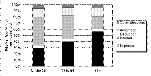
Table 4.10: Bill Payment by Method, FY 2009, 2010, and
2011 2
Figure 4.1: Monthly Average Household Bill Payment by
Method 2
Figure 4.2: Average Monthly Automatic Deductions per
Household 2
Table 4.11: Types of Bills Paid by Mail 2
Figure 4.3: Average Bills Paid per Month by Income and
Age 2
Figure 4.4: Bill Payment Method by Age 2
Table 4.12: Bill
and Statement Volumes by Industry 2
Table 4.13: Average Monthly Bills and Statements Received
by Method 2
5 Chapter 5:
Advertising Mail 2
Table 5.1: U.S.
Advertising Spending Growth by Medium, 2009-2011 2
Figure 5.1: Direct
Mail as a Share of Total Advertising, 1990-2011 2
Table 5.2:
Advertising Mail by Mail Classification 2
Table 5.3: Advertising Mail by Mail Classification 2
Table 5.4: Advertising Mail Received by Income and
Education 2
Table 5.5: Advertising Mail Received by Income and Age 2
Table 5.6: Advertising Mail Received by Size of
Household 2
Table 5.7: Advertising Mail Received by Number of Adults 2
Table 5.8: Advertising Mail Received by Internet Access 2
Table 5.9: Income and Education by Type of Internet
Access 2
Figure 5.2: Advertising Volumes for First-Class and
Standard Mail Advertising by Sender Type 2
Figure 5.3:
Advertising Mail Behavioral Trends, FY 1987, 2009, 2010, and
2011 2
Figure 5.4:
Treatment of Standard Mail by Type 2
Figure 5.5:
Treatment of Standard Advertising Mail by Number of Standard
Mail Pieces Received per Week 2
Table 5.10: Intended Response to
Advertising Mail by Class 2
Figure 5.6: Weekly
Number of Intended Responses by Income 2
6 Chapter 6:
Periodicals 2
Figure 6.1: Periodicals Mail Volume per Person, 1971-2011 2
Figure 6.2: Real Per-Capita Magazine Advertising
Spending, 1980-2011 2
Table 6.1: Periodical Type by Year 2
Figure 6.3: Newspaper Circulation, 1970-2009* 2
Figure 6.4: Daily Newspaper Readership, 1987-2011 2
Table 6.2: Periodicals by Income and Education 2
Table 6.3: Periodicals by Income and Age 2
Table 6.4: Periodicals by Size of Household 2
Table 6.5: Periodicals by Number of Adults in Household 2
Table 6.6: Periodicals by Type of Internet Access 2
Table 6.7: Income and Education by Type of Internet
Access 2
Figure 6.5: Subscription Type by Year 2
Table 6.8: Periodicals by Sender Type 2
Figure 6.6: Number of Periodicals Received per Week by
Households by Income Group 2
7 Chapter 7:
Packages 2
Table 7.1: Total Package Market Volume Growth 2
Figure 7.1: Package Delivery Market Segment Share 2
Table 7.2: Postal Service Sent and Received Packages, FY
2009, 2010, and 2011 2
Figure 7.2: Postal Service Sent and Received Packages by
Household Income 2
Table 7.3: Postal Service Received Packages by Income
and Age 2
Table 7.4: Postal Service Sent Packages by Income and
Age 2
Table 7.5: Postal Service Received Packages by Income
and Education 2
Table 7.6: Postal Service Sent Packages by Income and
Education 2
Table 7.7: Postal Service Received and Sent
Packages by Size of Household 2
Table 7.8: Postal Service Received and Sent
Packages by Number of Adults in
Household 2
Table 7.9: Received and Sent Packages by Household
Internet Access 2
Table 7.10: Income and Education by Type of Internet
Access 2
Table 7.11: Contents of Postal Service Sent and Received
Packages 2
This report
documents the findings of the United States Postal Service’s Household Diary
Study (HDS) for Fiscal Year (FY) 2011. The three main study purposes are to:
·
Measure the mail sent and received by U.S.
households,
·
Provide a means to track household mail trends
over time, and
·
Make comparisons of mail use between different
types of households.
The
report examines these trends in the context of changes and developments in the
wider markets for communications and package delivery.
Background
The
Household Diary Study survey, fielded continuously since 1987, aims to collect
information on household use of the mail and how that use changes over time.
The survey collects household information on demographics, lifestyle, attitudes
toward mail and advertising, bill payment behavior, and use of the Internet and
other information technologies.
The
FY 2011 report covers Government Fiscal Year 2011, with comparisons to 2009, 2010,
and other years, as appropriate.
The Household Diary Study collects information on household
mail use and provides
a look at how that use changes over time.
Overview
In
2011, U.S. households received 127.5 billion pieces of mail, and sent 16.1
billion, as seen in Table E.1. Mail sent or received by households constituted 83
percent of total mail in FY 2011. Fifty-seven percent of the mail households
received was sent Standard Mail. Only three percent of household mail was sent
between households; the rest was sent between households and non-households.
Table
E.1:
Mail Received and Sent by Households
(Billions of Pieces)
|
Mail Classification
|
Received
|
Sent
|
|
First-Class Mail
|
47.8
|
15.6
|
|
Standard Regular Mail
|
60.3
|
—
|
|
Standard Nonprofit Mail
|
12.0
|
—
|
|
Periodicals
|
5.4
|
—
|
|
Package & Shipping Services
|
2.1
|
0.5
|
|
Total
|
127.5
|
16.1
|
|
Household to Household
|
4.6
|
|
Total Mail Received and Sent by Households
|
139.1
|
|
FY 2010 RPW Total *
|
167.9
|
|
Non-household to
Non-household Residual
|
28.8
|
|
Unaddressed
|
1.1
|
—
|
Source:
HDS Diary Sample, FY 2011.
Note: Totals may not sum due to rounding.
* Includes First-Class and Standard Mail packages.
Mail
Markets
The
Household Diary Study examines mail by the markets it serves. This design cuts
across classes, but provides a foundation for understanding mail flows and the
marketplace changes that affect them. Table E.2 shows the volume of household
mail by market for 2009 through 2011.
Thirty-five
percent of household mail contains correspondence and transactions, down from 36
percent in 2010. In terms of volume, total correspondence fell 3.3 percent
compared to 2010. However, longer-term trends show that, over the past several
years, correspondence fell more significantly. For example, since 2002,
correspondence fell 33 percent. In part, the decline in correspondence is a
continuation of long-term trends, but it is also strongly related to changing
demographics and new technologies. Younger households send and receive fewer
pieces of correspondence mail because they tend to be early adaptors of new and
faster communication media such as e-mails, social networking, and smart
phones.
Table E.2:
Household Mail Volume Received and Sent by Market Served
(Billions of Pieces)
|
Market
|
2009
|
2010
|
2011
|
|
Correspondence
|
13.2
|
12.9
|
12.6
|
|
Transactions
|
41.2
|
37.6
|
35.6
|
|
Advertising
|
85.1
|
83.5
|
85.0
|
|
Periodicals
|
6.0
|
5.5
|
5.4
|
|
Packages
|
3.7
|
3.6
|
4.0
|
|
Unclassified
|
3.6
|
4.7
|
3.9
|
|
Total
|
145.0
|
141.2
|
139.1
|
Source: HDS Diary Sample, FY 2008, 2009, and 2011.
Notes:
Correspondence and Transactions include 7.4 billion pieces of First-Class
advertising-enclosed mail (excluded from totals).
Package volumes include ground packages and expedited, as well as
1.7 billion pieces of CD/DVD rentals.
Electronic
alternatives also affect transactions mail volume. Over time, automatic
deduction and online bill pay account for a growing share of household bill
payments. In fact, over the previous eight years, the percentage of bills paid
by electronic methods increased from 17 percent in 2002 to 51 percent in 2011.
In contrast, bills paid by mail decreased from 75 percent to 45 percent of
total payments over the same period of time. This was the first time that more
than half of bills were paid electronically.. In-person payments decreased from
8 percent in 2002 to 4 percent in 2011. Similarly, the Internet has contributed
to some decline in the share of bills and statements households received
through the mail. Bills and statements received online continue to grow at a
fast pace, albeit from a relatively small base ( in 2011 households received an
average of 2.8 pieces of bills and statements online, compared to 14.4 pieces
in the mail) .
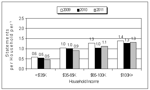
Advertising
mail represented well over half (61 percent) of all mail received by households
in 2011. As shown in Table E.3, 85 percent of all advertising mail received by
households is Standard Mail (72.3 billion pieces). The remainder consists of
First-Class Mail; either stand-alone advertising (5.3 billion pieces), or
secondary advertising that is sent along with other matter (7.4 billion
pieces).
Over
time, the data show a steady decline in the share of First-Class advertising
mail, from 21 percent in 2002 to only 15 percent in 2011.
Table E.3:
Advertising by Mail Class
|
Mail
Classification
|
Volume
(Billions)
|
Percent of Total Advertising
|
|
First-Class
Advertising
|
12.6
|
15%
|
|
Standard Regular
Mail
|
60.3
|
71%
|
|
Standard
Nonprofit Mail
|
12.0
|
14%
|
|
Total Advertising Mail
|
85.0
|
100%
|
Source: HDS Diary Sample, FY 2011.
As shown in
Table E.4, households received 5.4 billion Periodicals via mail in 2011, less
than in both 2009 and 2010. More than
three-quarters of these were magazines. Newspapers are only 15 percent of total
Periodicals, down from 35 percent in 1987. Contributors to the decline in
newspaper volumes were lower circulation and readership levels, as well as a
strong growth of the Internet as an alternative delivery method over the past
decade.
Table E.4:
Periodical Type Received
|
Mail
Classification
|
Volume
(Billions)
|
Percent of Total Periodicals
|
|
Newspapers
|
0.8
|
14%
|
|
Magazines
|
4.1
|
77%
|
|
Unclassified
|
0.5
|
9%
|
|
Total Periodicals
|
5.4
|
100%
|
Source: Household Diary Study, FY 2011.
In 2011,
households received 3.0 billion and sent 1.1 billion packages. Compared to 2010,
total packages sent and received increased 13 percent, with most of the growth
coming from First-Class packages. In
general, delivery from mail order and Internet retailers is an important driver
of package volume. While the HDS data is not designed to quantify this, there
are indications that online auction sites (like eBay) are responsible for some
of the recent increase in packages sent by households.
Table
E.5:
Packages Received and Sent via the U.S. Postal Service
(Millions of Pieces)
|
Mail Classification
|
2011
|
|
Received
|
Sent
|
|
Number
|
Percent
|
Number
|
Percent
|
|
First-Class Mail
|
1,424
|
47%
|
969
|
87%
|
|
Expedited
|
374
|
12%
|
75
|
7%
|
|
Standard Mail
|
667
|
22%
|
—
|
—
|
|
Package &
Shipping Services
|
546
|
18%
|
68
|
6%
|
|
Unclassified
|
2
|
0%
|
0
|
0%
|
|
Total Packages
|
3,013
|
100%
|
1,112
|
100%
|
Source: HDS Diary Sample, FY 2011.
Notes:
Totals may not sum due to rounding.
Expedited includes Priority Mail and Express Mail.
First-Class packages include 17 billion pieces of CD/DVD rentals sent to and
received from Netflix, Blockbuster, etc., reported in First-Class Mail letters
in Tables E.1, 1.5, and 1.6.
The United States Postal Service Household
Diary Study (HDS) Report documents the findings of the Fiscal Year (FY) 2011
study. The HDS measures the mail sent and received by U.S. households, tracks
household mail trends, and compares mail use between different types of households.
The Household
Diary Study
provides a means to track
household mail trends over time.
The Survey
The Household Diary Study survey, fielded
continuously since 1987, aims to collect information on household use of the
mail and how that use changes over time. The survey collects household
information on:
·
Demographics,
·
Attitudes toward mail and advertising,
·
Bill payment behavior, and
·
Use of the Internet and other information
technologies.
These data are used for market research,
forecasting, and strategic planning within the Postal Service.
The Survey Consists of Two Parts:
1) An entry, or recruitment interview,
conducted by phone or Web, collects demographic and attitudinal information
from about 8,500 households.
2)
These households then receive a mail
diary, which collects information on the mail the household sends
and receives in a one-week period. Annually, about 5,200 households
successfully complete the diary.
The data generated by these two instruments
are the basis of the analysis in this report.
The HDS FY 2011 report covers the period from
September 27, 2010, through September 25, 2011, roughly equivalent to the
Government Fiscal Year (GFY) used by the Postal Service. Data from FY 2009 and
FY 2010 are also reported on a GFY basis.
U.S. Postal
Service Volumes
Serving a nation containing five percent of
the world’s population, according to the Universal Postal Union, the Postal
Service delivers approximately 40 percent of the world’s mail. The Postal
Service delivered 167.9 billion pieces of mail in FY 2011—a decrease of 3.0
billion pieces, or 1.7 percent, from 2010.
Although the economic recession ended in June
2009, the sluggishness of the recovery that followed adversely affected mail
volumes well into FY 2011. Additionally, the continuing migration of
transaction and correspondence mail to the Internet and other electronic
alternatives further exacerbated the decline in volumes.
Standard Mail volume, consisting mostly of
advertising material, is strongly correlated to the health of the economy. Accordingly, in 2011, the slow recovery led
to modest growth, as volumes rose only 2.6 percent over 2010 (about 2.2 billion
pieces). Even so, the growth represented
the first increase since 2007, and was an improvement over flat volumes in 2010
compared to 2009
In 2011, First-Class Mail volume fell 6.4
percent (about 5 billion pieces), continuing a long-term negative trend that began
2001. Ongoing diversion of correspondence and transaction mail to electronic
alternatives and the weak economy were key contributors to the decline. First-Class
Single-Piece letters and cards, impacted mostly by the growing use of online
bill payments and emails, fell 10.7 percent from 2010 to 2011. Presort letters
and cards (which include most of the advertising material that is sent
First-Class) fell 3.7 percent from the combined impact of electronic diversion
and a sluggish economy.
The Postal Service estimates the revenues,
volumes, and weight of mail pieces going through the postal network by using a
combination of statistical sampling systems, mailing statements, and accounting
data. These data are published in the Revenue, Pieces, and Weight (RPW)
Reports.
Table 1.1 presents the RPW volumes for FY 2011,
along with data for FY 2010 and FY 2009.
Table 1.2 reports revenue, pieces, and weight
data by class and shape for FY 2011.
·
The
letters column heading includes postcards and refers to pieces that are
less than 11.5 inches wide by 6.125 inches tall and less than .25 inches thick.
·
Flats
consist of pieces that are greater than 11.5 inches wide, 6.125 inches tall, or
.25 inches thick, but less than 12 by 15 by .75 inches.
·
Parcels
are pieces that are larger than 12 by 15 inches, or thicker than .75 inches.
Because of the difficulty involved in
recording mail-piece characteristics in the Household Diary, these categories
do not correspond precisely to the shape categories used by HDS respondents.
Table 1.3 is derived from Table 1.2 and shows
the revenue per piece and weight per piece for each subclass of mail by shape.
Table 1.1:
Total Mail Volume: FY 2009,
2010, and 2011
(Billions of Pieces)
|
Mail Classification
|
2009
|
2010
|
2011
|
|
Mailing Services:
|
|
|
|
|
First-Class Mail:
|
|
|
|
|
Single-Piece
Letters & Cards
|
31.6
|
28.9
|
25.8
|
|
Presort
Letters & Cards
|
47.9
|
46.2
|
44.5
|
|
Flats
|
2.9
|
2.5
|
2.2
|
|
Parcels
|
0.6
|
0.6
|
0.6
|
|
Other *
|
0.8
|
0.3
|
0.3
|
|
Total First-Class Mail
|
83.8
|
78.2
|
73.5
|
|
Standard Mail:
|
|
|
|
|
High Density
& Saturation Letters
|
5.0
|
5.4
|
5.7
|
|
High Density
& Saturation Flats & Parcels
|
11.8
|
11.4
|
11.4
|
|
Carrier
Route
|
10.0
|
9.4
|
9.3
|
|
Letters
|
46.8
|
48.3
|
50.6
|
|
Flats
|
7.8
|
7.0
|
6.8
|
|
Not
Flat-Machinables & Parcels
|
0.7
|
0.7
|
0.7
|
|
Other *
|
0.4
|
0.3
|
0.2
|
|
Total Standard Mail
|
82.4
|
82.5
|
84.7
|
|
Periodicals
|
8.0
|
7.3
|
7.1
|
|
Package Services
|
0.7
|
0.7
|
0.7
|
|
USPS and Free Mail
|
0.5
|
0.5
|
0.5
|
|
Total
Mailing Services
|
175.4
|
169.2
|
166.5
|
|
Shipping Services
|
1.4
|
1.5
|
1.5
|
|
Total All Mail
|
176.8
|
170.9
|
167.9
|
Source:
RPW Reports.
Note: Totals may not sum due to
rounding.
* Other includes: Negotiated Service Agreements (NSAs), International Mail,
Express Mail, and Fees (not reported by shape).
Table
1.2:
Total Mail: Revenue, Pieces, and Weight by Shape, FY 2011
|
Mail Classification
|
Revenue
|
Pieces
|
Weight
|
|
(Millions of Dollars)
|
(Millions of Pieces)
|
(Millions of Pounds)
|
|
Letters
|
Flats
|
Parcels
|
Total
|
Letters
|
Flats
|
Parcels
|
Total
|
Letters
|
Flats
|
Parcels
|
Total
|
|
Mailing Services:
|
|
|
|
|
|
|
|
|
|
|
|
|
|
First-Class Mail:
|
|
|
|
|
|
|
|
|
|
|
|
|
|
Single-Piece
Letters & Cards
|
11,581
|
0
|
0
|
11,581
|
25,847
|
0
|
0
|
25,847
|
778
|
0
|
0
|
778
|
|
Presort
Letters & Cards
|
15,488
|
0
|
0
|
15,488
|
44,494
|
0
|
0
|
44,494
|
2,233
|
0
|
0
|
2,233
|
|
Flats
|
27
|
2,787
|
0
|
2,814
|
20
|
2,211
|
0
|
2,231
|
6
|
449
|
0
|
455
|
|
Parcels
|
2
|
136
|
1,147
|
1,284
|
1
|
80
|
557
|
638
|
0
|
21
|
188
|
209
|
|
Total
First-Class By Shape
|
27,098
|
2,923
|
1,147
|
31,168
|
70,363
|
2,290
|
557
|
73,210
|
3,018
|
470
|
188
|
3,675
|
|
Other*
|
|
|
|
1,011
|
|
|
|
310
|
|
|
|
51
|
|
Total
First-Class Mail
|
|
|
|
32,178
|
|
|
|
73,521
|
|
|
|
3,726
|
|
Standard Mail:
|
|
|
|
|
|
|
|
|
|
|
|
|
|
High Density
& Saturation Letters
|
768
|
0
|
0
|
768
|
5,654
|
0
|
0
|
5,654
|
238
|
0
|
0
|
238
|
|
High Density
& Saturation Flats & Parcels
|
73
|
1,808
|
0
|
1,881
|
506
|
10,918
|
1
|
11,425
|
23
|
2,121
|
0
|
2,144
|
|
Carrier
Route
|
26
|
2,196
|
0
|
2,222
|
125
|
9,211
|
0
|
9,336
|
5
|
1,988
|
0
|
1,993
|
|
Letters
|
9,707
|
0
|
0
|
9,708
|
50,584
|
0
|
0
|
50,584
|
2,667
|
0
|
0
|
2,667
|
|
Flats
|
1
|
2,488
|
1
|
2,491
|
3
|
6,777
|
3
|
6,783
|
1
|
1,709
|
0
|
1,710
|
|
Not
Flat-Machinables & Parcels
|
0
|
0
|
651
|
651
|
0
|
0
|
734
|
734
|
0
|
0
|
322
|
322
|
|
Total
Standard By Shape
|
10,575
|
6,492
|
652
|
17,720
|
56,872
|
26,906
|
738
|
84,516
|
2,933
|
5,818
|
322
|
9,074
|
|
Other*
|
|
|
|
106
|
|
|
|
176
|
|
|
|
19
|
|
Total
Standard Mail
|
|
|
|
17,826
|
|
|
|
84,692
|
|
|
|
9,092
|
|
Periodicals:
|
|
|
|
|
|
|
|
|
|
|
|
|
|
Total
Periodicals By Shape
|
13
|
1,795
|
4
|
1,813
|
75
|
6,995
|
6
|
7,077
|
5
|
2,712
|
8
|
2,725
|
|
Other *
|
|
|
|
8
|
|
|
|
0
|
|
|
|
0
|
|
Total
Periodicals
|
|
|
|
1,821
|
|
|
|
7,077
|
|
|
|
2,725
|
|
Package
Services
|
|
|
|
|
|
|
|
|
|
|
|
|
|
Total
Package Services
By Shape
|
0
|
236
|
1,342
|
1,578
|
0
|
263
|
412
|
675
|
0
|
381
|
1,403
|
1,784
|
|
Other*
|
|
|
|
27
|
|
|
|
0
|
|
|
|
0
|
|
Total
Package Services
|
|
|
|
1,606
|
|
|
|
675
|
|
|
|
1,784
|
|
USPS
and Free Mail
|
|
|
|
0
|
|
|
|
496
|
|
|
|
180
|
|
|
|
|
|
|
|
|
|
|
|
|
|
|
|
Total
Mailing Services
By Shape
|
37,687
|
11,447
|
3,145
|
52,279
|
127,310
|
36,455
|
1,712
|
165,478
|
5,956
|
9,380
|
1,922
|
17,258
|
|
Total Other*
|
|
|
|
1,153
|
|
|
|
983
|
|
|
|
249
|
|
Total
Mailing Services
|
|
|
|
53,432
|
|
|
|
166,461
|
|
|
|
17,507
|
|
|
|
|
|
|
|
|
|
|
|
|
|
|
|
Shipping Services:
|
|
|
|
|
|
|
|
|
|
|
|
|
|
Total
Shipping Services
By Shape
|
72
|
881
|
5,249
|
6,203
|
15
|
175
|
905
|
1,095
|
1
|
141
|
2,591
|
2,733
|
|
Total Other*
|
|
|
|
2,629
|
|
|
|
379
|
|
|
|
621
|
|
Total
Shipping Services
|
|
|
|
8,832
|
|
|
|
1,473
|
|
|
|
3,354
|
|
|
|
|
|
|
|
|
|
|
|
|
|
|
|
Total All Mail
|
|
|
|
62,263
|
|
|
|
167,934
|
|
|
|
20,860
|
|
Total
All Services**
|
|
|
|
3,476
|
|
|
|
1,362
|
|
|
|
870
|
|
Total
All Mail & Services
|
|
|
|
65,739
|
|
|
|
|
|
|
|
|
Source:
RPW Reports.
Note: Totals may not sum due to
rounding.
* Other includes: NSAs, International Mail, Express Mail and Fees (not reported
by shape).
** All Services include Ancillary and Special Services.
Table
1.3:
Total Mail: Revenue and Weight per Piece by Shape, FY 2011
|
Mail
Classification
|
Revenue per Piece
|
Weight per Piece
|
|
(Dollars)
|
(Ounces)
|
|
Letters
|
Flats
|
Parcels
|
Total
|
Letters
|
Flats
|
Parcels
|
Total
|
|
Mailing Services:
|
|
|
|
|
|
|
|
|
|
First-Class Mail:
|
|
|
|
|
|
|
|
|
|
Single-Piece
Letters & Cards
|
0.448
|
|
|
0.448
|
0.482
|
|
|
0.482
|
|
Presort
Letters & Cards
|
0.348
|
|
|
0.348
|
0.803
|
|
|
0.803
|
|
Flats
|
1.346
|
1.261
|
|
1.261
|
4.991
|
3.250
|
|
3.266
|
|
Parcels
|
|
1.703
|
2.060
|
2.013
|
|
4.153
|
5.402
|
5.236
|
|
Total First-Class By Shape
|
0.385
|
1.276
|
2.060
|
0.426
|
0.686
|
3.281
|
5.402
|
0.803
|
|
Other*
|
|
|
|
3.256
|
|
|
|
2.607
|
|
Total First-Class Mail
|
|
|
|
0.438
|
|
|
|
0.811
|
|
Standard Mail:
|
|
|
|
|
|
|
|
|
|
High Density
& Saturation Letters
|
0.136
|
|
|
0.136
|
0.673
|
|
|
0.673
|
|
High Density
& Saturation Flats
& Parcels
|
0.144
|
0.166
|
0.485
|
0.165
|
0.718
|
3.108
|
|
3.003
|
|
Carrier
Route
|
0.205
|
0.238
|
0.702
|
0.238
|
0.678
|
3.453
|
7.318
|
3.416
|
|
Letters
|
0.192
|
|
|
0.192
|
0.844
|
|
|
0.844
|
|
Flats
|
0.462
|
0.367
|
0.443
|
0.367
|
5.046
|
4.035
|
0.709
|
4.034
|
|
Not
Flat-Machinables & Parcels
|
|
|
0.887
|
0.887
|
|
|
7.012
|
7.012
|
|
Total Standard By Shape
|
0.186
|
0.241
|
0.885
|
0.210
|
0.825
|
3.460
|
6.990
|
1.718
|
|
Other*
|
|
|
|
0.604
|
|
|
|
1.680
|
|
Total Standard Mail
|
|
|
|
0.210
|
|
|
|
1.718
|
|
Periodicals
|
|
|
|
|
|
|
|
|
|
Total Periodicals By Shape
|
0.176
|
0.257
|
0.653
|
0.256
|
1.112
|
6.203
|
20.795
|
6.162
|
|
Other*
|
|
|
|
|
|
|
|
|
|
Total Periodicals
|
|
|
|
0.257
|
|
|
|
6.162
|
|
Package Services
|
|
|
|
|
|
|
|
|
|
Total Package Services
By Shape
|
0.000
|
0.897
|
3.259
|
2.338
|
0.000
|
23.112
|
54.535
|
42.275
|
|
Other*
|
|
|
|
|
|
|
|
|
|
Total Package Services
|
|
|
|
2.378
|
|
|
|
42.275
|
|
USPS and Free Mail
|
|
|
|
0.000
|
|
|
|
4.841
|
|
|
|
|
|
|
|
|
|
|
|
Total
Mailing Services
By Shape
|
0.296
|
0.314
|
1.837
|
0.316
|
0.749
|
4.117
|
17.957
|
1.669
|
|
Total Other*
|
|
|
|
1.172
|
|
|
|
4.047
|
|
Total
Mailing Services
|
|
|
|
0.321
|
|
|
|
1.683
|
|
|
|
|
|
|
|
|
|
|
|
Shipping Services:
|
|
|
|
|
|
|
|
|
|
Total
Shipping Services
By Shape
|
4.913
|
5.045
|
5.797
|
5.666
|
1.193
|
12.887
|
45.782
|
39.934
|
|
Total Other*
|
|
|
|
6.942
|
|
|
|
26.240
|
|
Total
Shipping Services
|
|
|
|
5.994
|
|
|
|
36.415
|
|
|
|
|
|
|
|
|
|
|
|
Total All Mail
|
|
|
|
0.371
|
|
|
|
1.987
|
Source:
RPW Reports.
Note: Totals may not sum due to
rounding.
* Other includes: NSAs, International Mail, Express Mail, and Fees (not
reported by shape).
Mail Flows
Mail volume can be
broken into four basic flows, based on origin and destination. These flows are:
1) Household
to household,
2) Household
to non-household,
3) Non-household
to household, and
4) Non-household
to non-household.
Table 1.4a shows
the total mail in each flow, and Table 1.4b shows pieces per household per
week.
Table 1.4a:
Total Domestic Mail Flows
(Billions of
Pieces)
|
Sent By:
|
Received
By:
|
|
Household
|
Non-household
|
Total Originating
|
|
Household
|
4.6
|
11.5
|
16.1
|
|
Non-household
|
123.0
|
28.8
|
151.8
|
|
Total
Destinating
|
127.5
|
40.4
|
167.9
|
Source: HDS Diary Sample, FY 2011.
Note: Totals may not sum due to
rounding.
Table 1.4b:
Total Domestic Mail Flows
|
Mail Flows
|
Billions of Pieces
|
Percent of Total Mail
|
|
Sent
by Household
|
16.1
|
10%
|
|
Non-Household
to Household
|
123.0
|
73%
|
|
Total Household Mail
|
139.1
|
83%
|
|
Non-Household
to
Non-Household
|
28.8
|
17%
|
|
Total Mail
|
167.9
|
100%
|
Table 1.4c:
Domestic Mail Flows per Household per Week
|
Sent By:
|
Received
By:
|
|
Household
|
Non-household
|
|
Household
|
0.7
|
1.6
|
|
Non-household
|
19.9
|
N/A
|
Source: Household Diary Study, FY 2011.
Household Mail
As shown in Tables
1.4a and 1.4b, domestic mail to and from households constituted 83 percent of
total mail volume in 2011, which equates to 22.5 pieces per week sent and
received by U.S. households. Table 1.5 presents the volumes of mail sent and
received by households as estimated from the HDS. The table shows the
categories in which the households record their mail. Households received 127.5
billion pieces of mail and sent 15.6 billion. Both of these totals include the 4.76
billion pieces of mail that households sent to each other. The total mail
received or sent by households in FY 2011 was 139.1 billion pieces.
Table
1.5:
Mail Received and Sent by Households
(Billions of Pieces)
|
Mail Classification
|
Received
|
Sent
|
|
First-Class Mail
|
47.8
|
15.6
|
|
Standard Regular
Mail
|
60.3
|
-
|
|
Standard
Nonprofit Mail
|
12.0
|
-
|
|
Periodicals
|
5.4
|
-
|
|
Packages &
Shipping Services*
|
2.1
|
0.5
|
|
Total
|
127.5
|
16.1
|
|
Household to
Household
|
4.6
|
|
Total Mail
Received and Sent by Households
|
139.1
|
|
FY 2011 RPW Total
|
167.9
|
|
Non-household to
Non-household (Residual)
|
28.8
|
|
Unaddressed
|
0.5
|
-
|
|
|
|
|
Source: HDS Diary Sample, FY 2011.
Note: Totals may not sum due to rounding.
* Includes First-Class and Standard Mail packages.
Table
1.6 presents these data in two other forms, annual volumes per household and
pieces per household per week. Many of the subsequent results in this report
are presented in terms of pieces per household per week.
Table 1.6:
Pieces Received and Sent per Household
|
Classification
|
Annual
Pieces per Household
|
Pieces per
Household
per Week
|
|
Mail Received
|
|
|
|
First-Class Mail
|
402
|
7.7
|
|
Standard Regular Mail
|
508
|
9.8
|
|
Standard Nonprofit Mail
|
101
|
2.0
|
|
Periodicals
|
45
|
0.9
|
|
Packages*
|
14
|
0.3
|
|
Expedited
|
3
|
0.1
|
|
Total Mail
Received
|
1075
|
20.7
|
|
Mail Sent
|
|
|
|
First-Class Mail:
|
1
|
2.5
|
|
Packages*
|
2
|
0.0
|
|
Expedited
|
2
|
0.0
|
|
Total Mail
Sent
|
136
|
2.6
|
|
Unaddressed
|
9
|
0.2
|
Source: HDS Diary Sample, FY 2011.
Note: Totals may not sum due to rounding.
* Includes First-Class and Standard Mail packages.
Classes and Markets
·
First-Class
Mail is used to send transactional mail, correspondence, and advertising.
Because it is limited to pieces weighing thirteen ounces or less, it primarily includes
letters and cards.
·
Standard
Mail is advertising mail. For the most part, Standard Mail comprises letters
and flats, although it contains a few postcards and packages as well.
·
Periodicals
are magazines and newspapers, and are predominantly flat-shaped.
·
Priority
Mail and Express Mail are expedited
services for delivering correspondence, transactional mail, and merchandise.
Priority and Express pieces can be of any shape except postcards.
·
Package
Services is used to deliver merchandise, books, catalogs, and media such as
CDs and DVDs. Most of this mail is parcel-shaped.
Table 1.7
crosswalks between classes of mail and the markets they serve.
Table 1.7:
Mail Received and Sent by Households
|
Class
|
Market (Billions of Pieces)
|
|
Correspondence
|
Transactions
|
Advertising
|
Periodicals
|
Packages
|
Total
|
|
First-Class Mail
|
12.6
|
35.6
|
12.6
|
-
|
2.3
|
55.7
|
|
Standard Mail
|
-
|
-
|
72.4
|
-
|
0.7
|
73.0
|
|
Periodicals
|
-
|
-
|
-
|
5.4
|
-
|
5.4
|
|
Packages & Shipping Services
|
-
|
-
|
-
|
-
|
1.0
|
1.0
|
|
Total
|
12.6
|
35.6
|
85.0
|
5.4
|
4.0
|
135.2
|
|
Unclassified
|
-
|
-
|
-
|
-
|
-
|
3.9
|
|
Total
Mail Received and Sent by Households
|
-
|
-
|
-
|
-
|
-
|
139.1
|
Source: HDS Diary Sample FY 2011.
Notes: Correspondence and Transactions include 7.4 billion pieces of secondary
advertising mail also reported in Advertising Mail.
The “Total” column for each class does not include pieces that could not be
identified according to markets (Unclassified).
First-Class Packages include 1.7 billion pieces of CD/DVD rentals sent to and
received from Netflix, Blockbuster, etc., reported in First-Class Mail letters
in Tables E.1, 1.5, and 1.6.
Report Organization
The rest of the Household Diary Study report is organized around
the markets the mail serves. Each chapter contains an analysis of the trends in
the HDS data, as well as a discussion of how those trends affect and are affected
by changes in the broader market. The following provides an overview of each
chapter.
Chapter 2: Profile of Mail
Usage gives an analysis of household demographics. This chapter examines
demographic trends over time and their impact on the mail, and discusses
attributing factors, such as access to technology and changing attitudes.
Chapter 3: Correspondence
examines mail that is used solely or primarily to deliver (non-sales-related)
communications, such as letters and greeting cards. This chapter includes
analysis of both personal and business correspondence.
Chapter 4: Transactions
reviews financial transactions in the mail and the impact of new technologies
on that market. It analyzes household bill payment trends with a focus on
technological and demographic change.
Chapter 5: Advertising Mail presents the trends in mail used
to deliver sales-related messages. It contains information on household
attitudes towards advertising by various media, treatment of advertising mail,
and demographic determinants of advertising mail receipt.
Chapter 6: Periodicals examines
magazines and newspapers delivered in the mail. It looks at how changing
demographics are affecting the market for periodicals, and what the
implications are for future volume.
Chapter 7: Packages analyzes household
use of various types of packages, and it discusses the household market for
merchandise delivery.
In addition, there
are three appendices to the report:
Appendix A contains a set of
comparative tables for FY 1987, FY 2010, and FY 2011, organized by class of
mail. A concordance is presented for comparison with pre-2000 reports.
Appendix B documents the study
methodology and discusses how the
data were collected, weighted, and adjusted, and compares demographic data in the
sample to that of the population as a whole.
Appendix C contains the instruments
used to administer the survey.
Introduction
This chapter provides information on
demographic trends and other factors affecting mail volume, providing a basis
for assessing mail volume growth. The breakouts introduced provide the basis
for much of the analyses in subsequent chapters.
The first section looks at growth in mail
volume, population, households, and delivery points over recent decades. The
next section examines the demographic characteristics of mail users,
contrasting higher-mail-volume households with lower-volume households. The
third section details the emerging demographic and technological trends that
will affect the future of mail. The last section examines some of the factors
affecting the use of post offices and mailboxes.
Mail Volume and
Demographics
Total U.S. mail volume grew from 110 billion
pieces in 1981 to 168 billion in 2011, an increase of 52 percent. This growth
outpaced the rate of population growth and household formation. Over the same
period, according to the U.S. Census Bureau, the adult population grew 33
percent and households grew about 44 percent. The number of places to which the
Postal Service delivers increased still faster, growing by 55 percent (see the
USPS annual reports). As Table 2.1 shows, however, volume decreased by an
average of two percent per year over the last ten years (due to large declines
from 2007 onward), while U.S. population growth, household formation, and
delivery points increased by an average of one percent per year. With falling
revenues and rising costs, the Postal Service suffered significant financial
losses towards the end of the decade.
Total U.S.
mail volume decreased by
an average of two percent per year
between 2001 and 2011,
while population and household
formation increased by an average
of one percent per year.
The 1980s was a time of extraordinary mail
volume growth that began in 1978 and continued through 1988. In 1984, mail
volume grew more than ten percent. During this period, technology facilitated
this growth. Construction of computerized databases and techniques for sorting
large amounts of data created a fertile climate for direct mail marketing.
Computerization of financial systems encouraged billing by mail and payments
through the mail. These innovations in business processes were further
encouraged by the expansion of postal rate discounts.
The Postal Service introduced work-sharing
discounts, encouraging mailers to prepare the mail in ways that reduce the
total system cost of creating and delivering the mail. Mailers could take
advantage of these discounts by sorting the mail in advance. The Postal Service
would receive the mail presorted to the individual ZIP codes and/or to the
carrier routes associated with those ZIP codes.
In the late 1980s and early 1990s, mail
volume growth barely kept pace with household growth. The demand for mail was
hurt by a recession and two very large rate increases. This was also a period
in which the Postal Service absorbed substantial costs that were reapportioned
from the Federal government’s retirement programs.
Table
2.1:
Mail Volume and Demographics
Average Annual Growth, 1981-2011
|
|
1981-1990
|
1991-2000
|
2001-2011
|
|
Total Mail Volume
|
4.6%
|
2.3%
|
-2.1%
|
|
Delivery Points
|
1.7%
|
1.5%
|
1.0%
|
|
Adult Population
|
1.5%
|
1.3%
|
1.2%
|
|
Households
|
1.4%
|
0.9%
|
0.9%
|
Source: U.S. Postal Service, U.S. Census Bureau.
The
latter half of the 1990s saw rapid growth in mail volume, spurred by a strong
economy and rates that increased by less than inflation. The Postal Service
also realigned the incentives built into its price structure. It reduced the
incentives mailers had for presorting mail and encouraged them to prebarcode their
mail. By 2002, the majority of letters the Postal Service received had
qualifying barcodes on them. This restructuring of the rates took advantage of
the extensive automation of mail preparation and sorting that occurred in the
previous decade.
During the 1990s,
the U.S. economy rapidly embraced information technology and integrated the
Internet into its business processes. An economic recession followed that began
in March 2001. The 2001 terrorist attacks on the World Trade Center and the
Pentagon led to large-scale disruptions of those mail services dependent on air
transport, such as First-Class, Priority, and Express Mail. When air service
was restored, Priority Mail was no longer allowed on commercial passenger
flights. Soon afterwards, lethal anthrax was sent through the mail, which
resulted in five deaths and a number of serious injuries. These terrorist
attacks, combined with the economic recession, caused mail volume to decline
2.2 percent in 2002, which was, at the time, the largest annual decline since
World War II. In 2003, Standard Mail volume recovered to a new high, but total
First-Class volume continued to decline. Work-shared First-Class Mail fell for
the first time ever. Since 2003, Standard Mail volume grew along with the
economy, reaching new highs and exceeding First-Class Mail for the first time
in 2005. Total First-Class volume, on the other hand, continued to decline, in
part due to the diversion of bills and statements to electronic alternatives
and the lower-cost Standard Mail option as an alternative to First-Class
advertising.
The economic
recession that began in December 2007 and ended in June 2009 had a severe
impact on the mail. Total mail volume plunged 12.7 percent in 2009—the largest
decline since the Great Depression. In July 2009, the recession was officially
over but was followed by a slow recovery that continued through the end of
2011, resulting in a five percent cumulative decline in total mail volume since
2009. Though slow, the recovery did stimulate a three percent increase in
Standard Mail between 2009 and 2011—a marked improvement from a 20 percent
decline during the recessionary period. Continuing electronic diversion and a
weak economy, however, brought about significant losses in First-Class Mail.
Between 2009 and 2011, volume fell 12 percent—a rate of decline similar to the
severe decline experienced during the recession (13 percent).
Between 2001 and
2011, total mail volume fell 19 percent, and First-Class volume fell 29
percent. During the same time period,
both the adult population and households increased nine percent and the Postal
Service added ten percent more delivery points to its network.
Continued growth in delivery points
has become an ongoing source
of pressure on postal costs.
The
Postal Service depends on mail volume growth to fund universal service. The
number of addresses the delivery network serves increases as the number of
American businesses and households increases. When mail volume falls, as was
the case between 2001 and 2011 the Postal Service’s ability to fund delivery
service is hampered because the Postal Service charges its customers for piece
volume but does not assess connect charges, access fees, or system fees, like
many other network enterprises.
Characteristics of Higher- and Lower-Volume Households
Tables 2.2 and 2.3
show the demographic characteristics of households by the amount of mail
received. It is apparent that household mail use is strongly correlated with
both income and education. Note, however, the similar correlation between mail
receipt and Internet access, which is also related to income and education.
Therefore, households that make the most use of the mail are the households
with the greatest opportunity to use alternatives to the mail.
These high-volume
households are taking advantage of the opportunity to move away from the mail.
Households that receive 30 or more pieces of mail each week pay an average of
35 percent of their bills online, up from 30 percent in 2009 and 33 percent in
2010. In comparison, households that receive less than 30 pieces of mail each
week paid an average of 30 percent of their bills online. However, the percentage of online bill
payments has also increased among these lower-volume households over time—up
from 27 percent in 2009 and 28 percent in 2010.
Table 2.2:
Characteristics of Higher- and Lower-Mail-Volume Households
|
Mail Received
(Pieces per Household
per week)
|
Households
(Millions)
|
Median
Annual Household Income
|
Households
w/ Internet Access
(Percent)
|
Annual
Bills Paid
(Pieces per Household per week)
|
Annual
Bills Paid by Internet
(Percent)
|
Mail Sent
(Pieces per Household per week)
|
|
45 or more
|
8.6
|
$111,854
|
95%
|
177
|
36%
|
4.7
|
|
36-44
|
11.6
|
$84,035
|
92%
|
160
|
35%
|
3.5
|
|
30-35
|
11.5
|
$79,817
|
92%
|
155
|
35%
|
3.0
|
|
24-29
|
18.4
|
$72,695
|
87%
|
150
|
32%
|
2.7
|
|
18-23
|
23.3
|
$56,475
|
81%
|
135
|
31%
|
2.2
|
|
12-17
|
20.6
|
$42,932
|
78%
|
116
|
30%
|
1.7
|
|
Less than 12
|
24.6
|
$22,111
|
70%
|
92
|
29%
|
0.9
|
|
Total
|
118.7
|
$57,722
|
82%
|
132
|
32%
|
2.3
|
Source: HDS Diary Sample, FY 2011.
Note: Mail received includes USPS and
Non-USPS mail.
Table 2.3:
Education of Higher- and Lower-Mail-Volume Households
|
Mail Received
(Pieces per Household
per week)
|
Households
(Millions)
|
Educational
Attainment of Head of Household
|
|
Less than
High School
|
High School Graduate
|
Some College or Technical School
|
College Graduate
|
|
45 or more
|
8.6
|
2%
|
17%
|
15%
|
66%
|
|
36-44
|
11.6
|
8%
|
23%
|
20%
|
48%
|
|
30-35
|
11.5
|
5%
|
25%
|
24%
|
46%
|
|
24-29
|
18.4
|
7%
|
26%
|
29%
|
38%
|
|
18-23
|
23.3
|
14%
|
31%
|
22%
|
33%
|
|
12-17
|
20.6
|
11%
|
35%
|
23%
|
30%
|
|
Less than 12
|
24.6
|
23%
|
33%
|
22%
|
21%
|
|
Total
|
118.7
|
12%
|
29%
|
23%
|
36%
|
Source:
HDS Diary Sample, FY 2011.
Note: Percentages may not total 100
percent due to heads of households who did not answer the educational
attainment question.
Mail received includes USPS and Non-USPS mail. Percentages in this table are
row percentages.
Excludes households not receiving any mail delivery at their home address (using
mailbox only).
Demographic Characteristics of
U.S. Households
This section
develops breakouts of households by demographic categories that influence the
volume of mail sent and received. It looks at both traditional and newly
emerging factors. The following chapters will show how mail volume varies with
these household characteristics.
Income, Education,
and Age
Traditionally,
mail use was largely determined by household income, education, and age. As
Table 2.4 shows, income and education are strongly correlated with each other,
as expected.
The relationship
between income and age, shown in Table 2.5, is somewhat more complicated. Up to
retirement, household income and age are fairly closely related. After
retirement, households earn substantially less; although by that point, mail
behavior is pretty well set, and older households continue to receive similar
amounts of advertising and periodicals, and pay similar amounts of bills, even
though their income declines.
Table 2.4:
Households by Income and Education
(Percent of
Households)
|
Household Income
(Thousands)
|
Educational
Attainment of Head of Household
|
Total
|
|
Less than
High School
|
High School Graduate
|
Some College or Technical School
|
College Graduate
|
|
Under $35
|
25%
|
40%
|
21%
|
13%
|
100%
|
|
$35 to $65
|
11%
|
31%
|
29%
|
29%
|
100%
|
|
$65 to $100
|
7%
|
27%
|
22%
|
44%
|
100%
|
|
Over $100
|
1%
|
13%
|
18%
|
67%
|
100%
|
|
Don’t know/
Refused
|
8%
|
26%
|
21%
|
43%
|
100%
|
|
Total
|
12%
|
29%
|
23%
|
36%
|
100%
|
Source: HDS Diary Sample, FY 2011.
Note: Totals may not sum due to
rounding.
Table 2.5:
Households by Income and Age
(Percent of
Households)
|
Household Income
(Thousands)
|
Age of
Head of Household
|
Total
|
|
Under 35
|
35 to 54
|
Over 55
|
Don’t
Know/ Refused
|
|
Under $35
|
22%
|
29%
|
49%
|
0%
|
100%
|
|
$35 to $65
|
24%
|
33%
|
43%
|
0%
|
100%
|
|
$65 to $100
|
24%
|
44%
|
32%
|
0%
|
100%
|
|
Over $100
|
14%
|
57%
|
28%
|
0%
|
100%
|
|
Don’t know/
Refused
|
21%
|
34%
|
41%
|
4%
|
100%
|
|
Total
|
22%
|
38%
|
39%
|
1%
|
100%
|
Source: HDS Diary Sample, FY 2011.
Note: Totals may not sum due to
rounding.
Household Size
The majority of U.S. households include either one or two adults,
but households with three or more adults make up 18 percent of the total. Once
considered the norm, nuclear families—two adults and at least one child—now
account for only 20 percent of households (per the U.S. Census Bureau). The
changing composition of households impacted the amount and kinds of mail sent
and received by households over the past 20 years, generating more and
different kinds of advertising mail, as well as affecting transaction mail
trends (bills tend to be tied to households as much as to individuals).
Table
2.6:
Households by Size
(Millions of Households)
|
Household Size
|
|
|
One person
|
24.8
|
|
Two
|
43.6
|
|
Three
|
21.1
|
|
Four
|
18.1
|
|
Five or more
|
11.1
|
|
Total
|
118.7
|
Source: HDS Diary Sample, FY 2011.
Note: Total may not sum due to rounding.
Table
2.7:
Households by Number of Adults
(Millions of
Households)
|
Number of Adults
|
|
|
One
|
27.5
|
|
Two
|
70.4
|
|
Three or more
|
20.9
|
|
Total
|
118.7
|
Source: HDS Diary Sample, FY 2011.
Note: Totals may not sum due to
rounding.
Internet Access
Access to the Internet and use of new
technologies, such as Broadband, have a large and growing impact on mail use. Bills,
statements, and bill payments still represent a significant number of pieces
sent and received by households. However, electronic activity in this area is diverting
mail once used for these purposes. On the other hand, online shopping
potentially adds packages and catalog delivery to the Postal Service mail
stream.
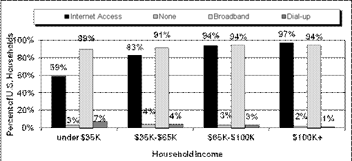
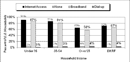
Table 2.8 shows that 82 percent of
households have Internet access and 76 percent have Broadband access. The
highest levels of Internet and Broadband access are within households with
incomes over $100,000 (97 and 94 percent, respectively), as seen in Figure 2.1a.
In comparison, households with incomes below $35,000 are less likely to have
access to the Internet and Broadband (59 and 57 percent, respectively). As
shown in Figure 2.1b, age is also an important determinant of households having
Internet access. Younger households (heads of households younger than 35 years
old) are more likely to have access to both the Internet and Broadband (91 and
87 percent, respectively). Older households (heads of households older than 55
years of age), on the other hand, are less likely to have access to the
Internet and Broadband (65 and 58 percent, respectively).
Table 2.8:
Households by Type of Internet Access
(Millions of
Households)
|
Type of
Internet Access
|
|
|
Broadband
|
90.1
|
|
Dial-up
|
7.4
|
|
None
|
21.2
|
|
Total
|
118.7
|
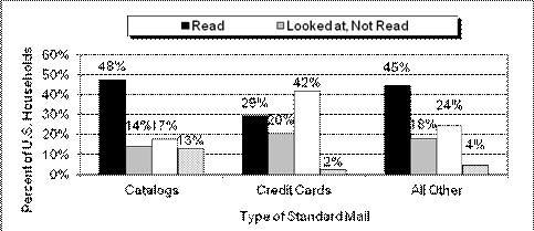
Source: HDS Diary Sample, FY 2011.
Note: Totals may not sum due to
rounding.
Figure
2.2 shows the trend in Broadband connections. The rapid growth of Broadband
expands the potential scope of electronic diversion of the mail. The Internet’s
fast, always-on connection makes it a stronger alternative medium for the
delivery of entertainment, information, and communication. As more households
begin using Broadband, the more that bill payments, bill and statement
presentment, periodicals, and even advertising mail, will be affected.
Figure
2.1a:
Internet Access by Income and Type
Source:
HDS Recruitment Data, FY 2011.
Note: Sum of Internet Access and None does
not equal 100 percent due to missing responses and access outside the home
only. Sum of Broadband and Dial-up does
not equal the 100 percent due to missing responses.
Figure
2.1b:
Internet Access by Age and Type
Source:
HDS Recruitment Data, FY 2011.
Note: Sum of Internet Access and None does
not equal 100 percent due to missing responses and access outside the home
only. Sum of Broadband and Dial-up does
not equal the 100 percent due to missing responses.
Figure
2.2:
Broadband Subscribers

Source: Leichtman Research Group.
Use of the Post Office
The Postal Service
currently owns and operates 35,756 post office locations throughout the U.S.
As shown in Figure 2.3, in spite of a declining frequency of visits from the
prior year, the use of post offices for mailing services continues to dominate
the mail service industry. Over 60 percent of all U.S. households patronize a
post office at least once a month, while just 14 percent visit a private
mailing company. Over 27 percent of all households in the U.S. visit the post
office three or more times a month. Even with the continued availability of
mail-related products and services through alternative modes (such as Internet
orders), in-person visits to postal facilities remain strong.
A rented mailbox
is one alternative that households use to manage their mail. In 2011, 2.8
percent of all households in the U.S. rented mailboxes from the Postal Service,
and 0.8 percent rented a box from a private company. Post office box use,
however, declined in the past ten years, with 2.8 percent of U.S. households
renting a post office box from the Postal Service in 2011, compared to 10
percent in 2001.
Introduction
This chapter examines correspondence mail among households
and between households and businesses, including letters, greeting cards,
invitations, and announcements. In several cases, this chapter, and several
following it, examines comparisons in data between 2009 and 2011, providing an
illustration of mail trends over time.
Correspondence Mail Volume
Total correspondence sent and received represents about
ten percent of all household mail volumes, as shown in Table E.2. Table 3.1
provides a recent history of total correspondence volumes, showing a 4.4
percent decline from 2009 to 2011. Personal correspondence, which is
essentially household to household mail, fell 16 percent from 2009 to 2011,
continuing a declining long-term trend that started almost 25 years ago. In
1987, households reported receiving 1.6 pieces of personal correspondence each
week. By 2011, personal correspondence received declined 56 percent, to just
0.7 pieces per household per week.
In large part, this decline stemmed from competition from
an ever-changing landscape of communication technologies, such as affordable
long-distance telephone service and, more recently, e-mail, social networking,
and cellular communications—all of which provide an alternative to personal
letters and business inquiries. Such advances in technological communications
completely transformed the marketplace, and continue to have an impact on
personal correspondence. It should be noted that the increases in household
correspondence to and from non-households shown in Table 3.1 resulted from
questionnaire improvements implemented in the 2011 survey. As a result,
previously unclassified volumes were restated to more specific mail
categories.
Correspondence Mail and
Household Characteristics
The following tables break down correspondence mail sent
and received by households using the demographic categories developed in
Chapter 2.
Income, Education, and Age
Tables 3.2 and 3.3 on the following page show that both
household income and educational attainment have a strong effect on
correspondence sent and received by households. In most cases, the volume of
correspondence sent and received by households with the highest income or the
highest education is more than double the volume that is sent and received by
households with the lowest income or the lowest education.
Table
3.1:
First-Class Correspondence Mail Sent and Received by Sector
|
Sector
|
Volume (Millions of Pieces)
|
Change,
2009-2011
|
|
2009
|
2010
|
2011
|
|
Household to household
|
5,225
|
4,959
|
4,387
|
-16.0%
|
|
Non-household to household
|
6,057
|
6,082
|
6,464
|
6.7%
|
|
Household to non-household
|
1,911
|
1,882
|
1,762
|
-7.8%
|
|
Total
|
13,192
|
12,922
|
12,613
|
-4.4%
|
|
Sector
|
Pieces per Household per Week
|
Share of 2011 Total
|
|
2009
|
2010
|
2011
|
|
Household to household
|
0.9
|
0.8
|
0.7
|
34.8%
|
|
Non-household to household
|
1.0
|
1.0
|
1.0
|
51.2%
|
|
Household to non-household
|
0.3
|
0.3
|
0.3
|
14.0%
|
|
Total
|
2.2
|
2.1
|
2.0
|
100%
|
Source: HDS Diary Sample, FY 2009, 2010, and 2011.
Notes: Totals may not sum due to
rounding.
Increases in correspondence between
households and non-households are due to 2011 questionnaires changes restating
previously unclassified mail pieces.
Table 3.2:
Correspondence Mail Received by Income and Education
(Pieces per Household per
Week)
|
Household Income (Thousands)
|
Educational Attainment of Head of Household
|
Average
|
|
Less than
High School
|
High School
Graduate
|
Some
College or Technical School
|
College
Graduate
|
|
Under $35
|
.8
|
1.3
|
1.3
|
1.4
|
1.2
|
|
$35 to $65
|
1.4
|
1.7
|
1.5
|
1.8
|
1.6
|
|
$65 to $100
|
1.1
|
1.5
|
1.6
|
2.3
|
1.9
|
|
Over $100
|
4.7
|
2.3
|
2.1
|
2.7
|
2.5
|
|
Average
|
1.1
|
1.5
|
1.6
|
2.3
|
1.8
|
Source: HDS Diary Sample, FY 2011.
Note: Excludes Don’t Know/Refused.
*The large number is due to a
very small sample size for this category.
Table
3.3:
Correspondence Mail Sent by Income and Education
(Pieces per Household per
Week)
|
Household Income
(Thousands)
|
Educational Attainment of Head of Household
|
Average
|
|
Less than
High School
|
High School
Graduate
|
Some
College or Technical School
|
College
Graduate
|
|
Under $35
|
.2
|
.8
|
.7
|
.8
|
.7
|
|
$35 to $65
|
.6
|
.9
|
.9
|
1.1
|
.9
|
|
$65 to $100
|
1.3
|
.8
|
.9
|
1.4
|
1.1
|
|
Over $100
|
1.7
|
.9
|
1.1
|
1.6
|
1.4
|
|
Average
|
.5
|
.8
|
.9
|
1.4
|
1.0
|
Source: HDS Diary Sample, FY 2011.
Note: Excludes Don’t Know/Refused.
Tables 3.4 and 3.5 show that age also has a significant
effect on correspondence mail sent and received by households. Regardless of
their income, in most cases, younger households both send and receive fewer
pieces of correspondence mail. Young adults have
traditionally sent and received less mail than older adults, but the advent of
the Internet age widened the gap between these two age groups.
Table
3.4:
Correspondence Mail Received by Income and Age
(Pieces per Household per
Week)
|
Household Income
(Thousands)
|
Age of Head of Household
|
Average
|
|
Under 34
|
35 to 54
|
Over 55
|
|
Under $35
|
1.0
|
1.1
|
1.3
|
1.2
|
|
$35 to $65
|
1.4
|
1.3
|
2.0
|
1.6
|
|
$65 to $100
|
1.6
|
1.8
|
2.2
|
1.9
|
|
Over $100
|
2.3
|
2.6
|
2.5
|
2.5
|
|
Average
|
1.4
|
1.8
|
1.9
|
1.8
|
Source: HDS Diary Sample, FY 2011.
Table 3.5:
Correspondence Mail Sent by Income and Age
(Pieces per Household per
Week)
|
Household Income
(Thousands)
|
Age of Head of Household
|
Average
|
|
Under 34
|
35 to 54
|
Over 55
|
|
Under $35
|
.3
|
.6
|
.9
|
.7
|
|
$35 to $65
|
.8
|
.6
|
1.3
|
.9
|
|
$65 to $100
|
1.0
|
1.0
|
1.4
|
1.1
|
|
Over $100
|
.9
|
1.5
|
1.5
|
1.4
|
|
Average
|
.7
|
1.0
|
1.2
|
1.0
|
Source: HDS Diary Sample, FY 2011.
Household Size
As would be expected, household size has a positive effect
on correspondence mail. Tables 3.6 and 3.7 show that the jump from one person
to two is associated with a considerable increase in correspondence mail.
Further increases in size can have varying effects. As shown in Table 3.7,
these increases are generally because of the presence of an additional adult in
the household.
Table
3.6:
Correspondence Mail Received and Sent
by Household Size
(Pieces per Household per Week)
|
Household
Size
|
Received
|
Sent
|
|
One person
|
1.1
|
.8
|
|
Two
|
1.8
|
1.1
|
|
Three
|
1.8
|
.9
|
|
Four
|
2.3
|
1.2
|
|
Five or more
|
2.0
|
1.0
|
|
Total
|
1.8
|
1.0
|
Source: HDS Diary Sample, FY 2011.
Table 3.7:
Correspondence Mail Received and Sent
by Number of Adults in Household
(Pieces per Household per Week)
|
Number of
Adults
|
Received
|
Sent
|
|
One
|
1.1
|
.7
|
|
Two
|
1.9
|
1.1
|
|
Three or more
|
2.0
|
1.1
|
|
Average
|
1.8
|
1.0
|
Source: HDS Diary Sample, FY 2011.
Internet Access
Table 3.8 shows that households with Internet access
(Broadband and Dial-up) tend to send and receive more correspondence mail than
households without such service. The explanation for this somewhat
counterintuitive result is the high correlation among income, educational
attainment, and the presence of an Internet connection in the home. As Table
3.9 shows, households with Internet access have a greater average income than
households without a connection. Similarly, on average, households with
Internet access have a higher level of education than those without access. In
fact, these correlations could be a warning sign for mail, since more volume
goes to households that are vulnerable to diversion.
Table
3.8:
Correspondence Mail Received and Sent by Type of Internet Access
(Pieces per Household per
Week)
Source: HDS Diary Sample, FY 2011.
Table
3.9:
Income and Education by Type of Internet Access
|
Type of
Internet Access
|
Median Income
|
% w/ College Degree
|
|
Broadband
|
67,538
|
43%
|
|
Dial-up
|
51,080
|
27%
|
|
None
|
23,139
|
12%
|
Source: HDS Diary Sample, FY 2011.
Personal
Correspondence
In FY 2011, personal correspondence accounted for an
average of 0.7 pieces of mail per week, which is lower than in both 2009 and
2010. Table 3.10 shows the total volumes and average number of pieces by
personal correspondence type.
The volume of personal letters continued to decline in
2011—a trend primarily driven by the adoption of the Internet as a preferred
method of communication. Similarly, all other types of personal correspondence
also fell because of the increasing availability of new electronic alternatives
(such as e-cards, e-vites, smart phones, and social networks).
Each year, the rise of these new
virtual technologies continues to change the way friends and family stay in touch.
The weak economic recovery also contributed to the decline, as spending on
cards and other correspondence-related products also decreased.
Table
3.10:
Personal Correspondence Sent and Received
|
Correspondence Type
|
Volume (Millions of Pieces)
|
Change, 2009-2011
|
|
2009
|
2010
|
2011
|
|
Personal Letters
|
956
|
850
|
644
|
-32.6%
|
|
Holiday Greeting Cards
|
1,959
|
2,073
|
1,945
|
-0.7%
|
|
Non-Holiday Greeting Cards
|
1,409
|
1,295
|
1,173
|
-16.7%
|
|
Invitations/Announcements
|
686
|
522
|
492
|
-28.2%
|
|
Other Personal
|
215
|
219
|
133
|
-38.0%
|
|
Total
|
5,225
|
4,959
|
4,387
|
-16.0%
|
|
Correspondence Type
|
Pieces per Household per Week
|
Share of 2011 Total
|
|
2009
|
2010
|
2011
|
|
Personal Letters
|
.2
|
.1
|
.1
|
14.7%
|
|
Holiday Greeting Cards
|
.3
|
.3
|
.3
|
44.3%
|
|
Non-Holiday Greeting Cards
|
.2
|
.2
|
.2
|
26.7%
|
|
Invitations /
Announcements
|
.1
|
.1
|
.1
|
11.2%
|
|
Other Personal
|
.0
|
.0
|
.0
|
3.0%
|
|
Total
|
.9
|
.8
|
.7
|
100.0%
|
Source: HDS Diary Sample, FY 2009, 2010, and 2011.
Note: Totals may not sum due to
rounding.
Figure 3.1:
Personal Correspondence Sent by Income Group
(Pieces per Household per
Year)
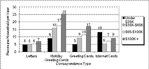
Source: HDS Diary Sample, FY 2011.
Figure 3.2:
Personal Correspondence Sent by Age Cohort
(Pieces per Household per
Year)
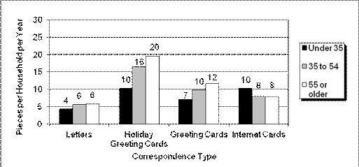
Source: HDS Diary Sample, FY 2011.
Figure 3.1 above shows the major personal correspondence
types by income. Personal correspondence sent by households seems to follow a
pattern of higher-income households being more likely to send letters, holiday
cards, and non-holiday greeting cards than lower-income households.
The largest disparity between
high- and low-income households is in the volume of holiday greeting cards
sent. Households with incomes greater than 100,000 sent an average of 25
holiday greeting cards in FY 2011, compared to the nine cards sent by
households with incomes lower than $35,000.
Internet card use is quickly growing to a level comparable
to non-holiday greeting card mail. For household with incomes lower than
$35,000, the high volume of internet cards sent (13 per household per year) is
probably due to a greater adoption rate by the younger heads of households, who
typically have lower incomes.
The number of letters and greeting cards sent also seems
to follow a pattern where households in which the head of household is aged 55
or older, on average, send more greeting cards than younger heads of household
sent—an average of six letters and 20 holiday greeting cards in 2011. Figure
3.2 illustrates this point. These households also sent an average of 12
non-holiday greeting cards.
In comparison, younger households (in which the head of
household is aged 35 or younger) sent an average of four letters, ten holiday
greeting cards, and seven non-holiday cards in FY 2011.
The relationship between holiday greeting cards received
and income is shown in more detail in Figure 3.3. In FY 2011, as in prior
years, higher-income households received the most holiday greeting cards.
Households with incomes greater than $100,000 received 25 holiday greeting
cards, while households with incomes lower than $35,000 received only nine
holiday greeting cards in FY 2011.
When examined by age, the number of holiday greeting cards
received is typically much greater for households where the head of household
is older. In 2011, households where the head of household is aged 55 or older,
on average, received 20 holiday greeting cards, while households where the head
of household is younger (35 or younger) received only ten.
Figure 3.3:
Holiday Greetings Received
by Age and Income, FY 2009, 2010, and 2011
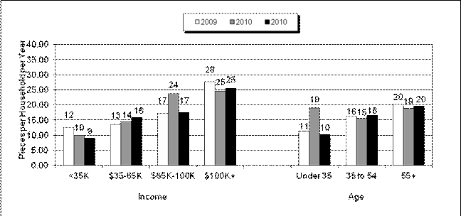
Source: HDS Diary data, Diary Sample only, FY 2009,
2010, and 2011.
As shown in Table 3.11, households with Internet access
(including both Broadband and Dial-up) receive more letters, holiday cards, and
non-holiday greeting cards, compared to households without Internet access. As
discussed earlier, households with Internet access, on average, have higher
income and education levels (see Table 3.9) attributes that typically lead to a
greater use of written correspondence.
Business
Correspondence
This section of the report provides data on correspondence
types between households and businesses. In addition to correspondence mail,
households and businesses exchange bill payments, statements, and advertising
(discussed in Chapters 4 and 5). Table 3.12 outlines volumes by types of
correspondence for 2009 through 2011. Correspondence received from the
non-household sector accounts for about 50 percent of all correspondence sent
and received by households (see Table 3.1).
Invitations and announcements represent 42 percent of business
and government correspondence received by households. Announcements are also
the main type of social correspondence households receive; in 2011 they
represented almost 85 percent of all social mail received.
As noted earlier, the increases in correspondence over
prior years (shown in Table 3.12) are due to questionnaire improvements
implemented in 2011. As a result,
previously unclassified mail pieces were placed in more specific categories,
creating distortion in growth rates from prior years.
Table 3.12: Business Correspondence Type (Sent and
Received) by Sector (Millions of Pieces)
|
Business
Correspondence Type
|
2009
|
2010
|
2011
|
Change,
2009–2011
|
|
Business/Government/Social Received by Households
|
|
|
|
|
|
Invitation/Announcement
|
1,934
|
1,781
|
2,003
|
3.6%
|
|
Holiday Greeting from Business
|
396
|
323
|
358
|
-9.6%
|
|
Other Business/Government
|
1,671
|
2,050
|
2,381
|
42.5%
|
|
Total Business/Government Received
|
4,000
|
4,154
|
4,742
|
18.5%
|
|
Announcement
|
1,382
|
1,375
|
1,241
|
-10.2%
|
|
Other Social
|
675
|
552
|
481
|
-28.8%
|
|
Total Social Received
|
2,057
|
1,928
|
1,722
|
-16.3%
|
|
Total Received
|
6,057
|
6,082
|
6,464
|
6.7%
|
|
Business/Government/Social Sent from Households
|
|
|
|
|
|
Inquiry
|
404
|
408
|
79
|
-80.4%
|
|
Other Business/Government
|
1,146
|
1,101
|
1,373
|
19.8%
|
|
Total Business/Government Sent
|
1,550
|
1,509
|
1,452
|
-6.3%
|
|
Letter
|
61
|
86
|
40
|
-33.7%
|
|
Inquiry
|
58
|
52
|
2
|
-95.8%
|
|
Other Social
|
242
|
234
|
267
|
10.7%
|
|
Total Social Sent (Social includes social,
political & nonprofit.)
|
361
|
373
|
310
|
-14.0%
|
|
Total Sent
|
1,911
|
1,882
|
1,762
|
-7.8%
|
Source: HDS Diary Sample, FY 2009, 2010, and 2011.
Notes: Totals may not sum due to
rounding.
Increases in correspondence
between households and non-households are due to 2011 survey questionnaire
improvements which restated previously unclassified mail.
Introduction
This chapter
examines the volumes and trends in transactions mail: the bills, statements,
payments, donations, rebates, and orders sent and received by households.
Information is presented on household bill payment trends, which is of
particular interest, as the availability of electronic alternatives affects
traditional transactions mail.
Transactions
Mail Volume
Transactions sent
and received constitute slightly more
than 25 percent of all household mail volumes (as seen in Table E.2) and 62 percent
of household First-Class Mail; as such, they are an important part of the mail
stream. Although many businesses use electronic funds transfer (EFT) or other
electronic technologies to settle transactions, households still receive and
pay a majority of their recurring bills through the Postal Service. As the
Internet and Broadband become more ubiquitous, however, the movement towards
consumer Electronic Bill Presentment and Payment (EBPP) is expected to continue
gaining momentum.
As Table 4.1
shows, the total transactions volume sent and received by households fell 13.7 percent
between 2009 and 2011. All major transaction categories contributed to the
decline (the increase in insurance related transactions is due to a restatement
of previously unclassified mail). Electronic diversion continues to erode the
volume of mail payments in favor of online payments, automatic deductions from
bank accounts, and other electronic methods of bill payment. The availability
of new payment alternatives, accompanied by an unprecedented economic downturn,
resulted in a 22 percent decline in bills paid by mail between 2009 and 2011.
The growth in non-mail methods of payments is also evident in Table 4.1, which
shows that bills paid by mail are far fewer than total bills received (as
discussed below, only 45 percent of all household bills were paid by mail in
2011).
Table
4.1: Transactions Mail
Sent and Received
|
Transaction Type
|
Volume (Millions
of Pieces)
|
Change,
2009–2011
|
|
2009
|
2010
|
2011
|
|
Business
|
|
|
|
|
|
Bills
|
17,773
|
16,132
|
14,927
|
-16.0%
|
|
Bill Payments
|
8,580
|
8,088
|
6,707
|
-21.8%
|
|
Statements
|
7,279
|
6,375
|
5,618
|
-22.8%
|
|
Confirmations
|
1,461
|
1,285
|
1,275
|
-12.7%
|
|
Payments (to HH)
|
2,559
|
2,543
|
2,343
|
-8.4%
|
|
Orders
|
454
|
394
|
270
|
-40.5%
|
|
Rebates
|
175
|
161
|
140
|
-20.4%
|
|
Insurance Related
|
1,222
|
896
|
2,485
|
103.3%
|
|
Other Transactions
|
144
|
132
|
442
|
207.2%
|
|
Total Business
|
39,648
|
36,006
|
34,207
|
-13.7%
|
|
Social/Charitable
|
|
|
|
|
|
Requests for Donation
|
617
|
657
|
674
|
9.3%
|
|
Donations
|
521
|
484
|
366
|
-29.8%
|
|
Bills
|
184
|
169
|
124
|
-32.6%
|
|
Confirmations
|
274
|
265
|
207
|
-24.7%
|
|
Total Social/Charitable
|
1,596
|
1,575
|
1,370
|
-14.1%
|
|
Total Transactions
|
41,244
|
37,581
|
35,577
|
-13.7%
|
Table 4.1: Transactions Mail Sent and Received (cont.)
|
Transaction Type
|
Pieces per
Household per Week
|
Share 2011
|
|
2009
|
2010
|
2011
|
|
Business
|
|
|
|
|
|
Bills
|
2.9
|
2.6
|
2.4
|
42.0%
|
|
Bill Payments
|
1.4
|
1.3
|
1.1
|
18.9%
|
|
Statements
|
1.2
|
1.0
|
0.9
|
15.8%
|
|
Confirmations
|
0.2
|
0.2
|
0.2
|
3.6%
|
|
Payments (to HH)
|
0.4
|
0.4
|
0.4
|
6.6%
|
|
Orders
|
0.1
|
0.1
|
0.0
|
0.8%
|
|
Rebates
|
0.0
|
0.0
|
0.0
|
0.4%
|
|
Insurance Related
|
0.2
|
0.1
|
0.4
|
7.0%
|
|
Other Transactions
|
0.0
|
0.0
|
0.1
|
1.2%
|
|
Total Business
|
6.5
|
5.9
|
5.5
|
96.1%
|
|
Social/Charitable
|
|
|
|
|
|
Requests for Donation
|
0.1
|
0.1
|
0.1
|
1.9%
|
|
Donations
|
0.1
|
0.1
|
0.1
|
1.0%
|
|
Bills
|
0.0
|
0.0
|
0.0
|
0.3%
|
|
Confirmations
|
0.0
|
0.0
|
0.0
|
0.6%
|
|
Total Social/Charitable
|
0.3
|
0.3
|
0.2
|
3.9%
|
|
Total Transactions
|
6.8
|
6.1
|
5.8
|
100.0%
|
Source: HDS Diary Sample, FY 2009, 2010, and 2011.
Historical
data was restated as a result of improvements to the 2011 survey questionnaires,
which restated previously unclassified mail.
The increase in the newly created insurance related category is also related to
the changes to the questionnaires.
Transactions Mail and
Household Characteristics
The following
tables break down transactions mail sent and received by households based on
the demographic categories introduced in Chapter 2.
Income,
Education, and Age
As seen in Tables
4.2 and 4.3, household income and educational attainment influence the amount
of transactions mail sent and received. In most cases, income has a much
greater impact on transactions mail received than sent. The basis for this
relationship is that higher-income households are more likely to be broadband
households and more likely to pay bills through non-mail means. The tables also
show that income has a greater impact on transactions mail than education.
Better-educated households, on average, have more financial accounts, insurance
policies, and credit cards—all generators of transactions mail volume.
Table
4.2:
Transactions Mail Received by Income and Education
(Pieces per Household per Week)
|
Household Income
(Thousands)
|
Educational
Attainment of Head of Household
|
Average
|
|
Less than
High School
|
High School Graduate
|
Some College or Technical School
|
College Graduate
|
|
Under $35
|
2.4
|
3.1
|
2.9
|
3.1
|
2.9
|
|
$35 to $65
|
4.9
|
5.0
|
4.9
|
4.3
|
4.8
|
|
$65 to $100
|
5.3
|
5.5
|
5.7
|
5.2
|
5.4
|
|
Over $100
|
4.5
|
6.8
|
6.2
|
5.8
|
6.0
|
|
Average
|
3.4
|
4.4
|
4.7
|
5.0
|
4.6
|
Source: HDS Diary Sample, FY 2011.
Table 4.3:
Transactions Mail Sent by Income and Education
(Pieces per
Household per Week)
|
Household Income
(Thousands)
|
Educational
Attainment of Head of Household
|
Average
|
|
Less than
High School
|
High School Graduate
|
Some College or Technical School
|
College Graduate
|
|
Under $35
|
.7
|
.9
|
1.0
|
1.1
|
.9
|
|
$35 to $65
|
1.7
|
1.5
|
1.2
|
1.1
|
1.3
|
|
$65 to $100
|
3.0
|
1.6
|
1.0
|
1.1
|
1.3
|
|
Over $100
|
2.5
|
1.4
|
1.5
|
1.2
|
1.3
|
|
Average
|
1.3
|
1.3
|
1.2
|
1.1
|
1.2
|
Source: HDS Diary Sample, FY 2011.
Tables 4.4 and 4.5 show that age has a strong effect on
transactions mail, independent of income. Across all income categories, younger
households send and receive less transactions mail. In part, this is because
such households are less likely to own their home and have fewer insurance
policies, investments, and the like. However, it is also the case that these
households are more active users of electronic alternatives to traditionally
mail-based transactions. This is particularly evident for transactions mail
sent (primarily bill payments) where households in which the head of household
is aged 35 years or younger sent only about one-half and one-third as much mail
as households where the head of household is 35 to 54 and over 55 years old,
respectively.
Across all
income categories,
younger households send and receive
less transactions mail.
Table
4.4:
Transactions Mail Received by Income and Age
(Pieces per
Household per Week)
|
Household Income
(Thousands)
|
Age of
Head of Household
|
Average
|
|
Under 35
|
35 to 54
|
Over 55
|
|
Under
$35
|
2.0
|
2.8
|
3.3
|
2.9
|
|
$35
to $65
|
3.7
|
4.9
|
5.3
|
4.8
|
|
$65
to $100
|
4.2
|
5.5
|
6.2
|
5.4
|
|
Over
$100
|
4.8
|
5.8
|
7.0
|
6.0
|
|
Average
|
3.3
|
4.9
|
5.0
|
4.6
|
Source: HDS Diary Sample, FY 2011.
Table
4.5:
Transactions Mail Sent by Income and Age
(Pieces per Household per Week)
|
Household Income
(Thousands)
|
Age of
Head of Household
|
Average
|
|
Under 35
|
35 to 54
|
Over 55
|
|
Under
$35
|
.4
|
.6
|
1.2
|
.9
|
|
$35
to $65
|
.7
|
1.2
|
1.7
|
1.3
|
|
$65
to $100
|
.9
|
1.0
|
2.1
|
1.3
|
|
Over
$100
|
.6
|
1.2
|
1.9
|
1.3
|
|
Average
|
.6
|
1.0
|
1.6
|
1.2
|
Source:
HDS Diary Sample, FY 2011.
Household
Size
In terms of
household size, Table 4.6 shows that the increase from a one-person household
to a two-person household adds 1.8 pieces of transactions mail per week
received and 0.4 pieces per week sent, but a larger household size has little
effect on volume.
Table
4.6:
Transactions Mail Received and Sent by Household Size
(Pieces per Household per Week)
|
Household Size
|
Received
|
Sent
|
|
One
person
|
3.0
|
1.0
|
|
Two
|
4.8
|
1.4
|
|
Three
|
5.1
|
1.4
|
|
Four
|
5.4
|
.9
|
|
Five
or more
|
4.9
|
.9
|
|
Average
|
4.6
|
1.2
|
Source: HDS Diary Sample, FY 2011.
For
transactions mail received, Table 4.7 shows that one additional adult adds
about 1.8 pieces (on average) of mail received per week. However, one
additional adult generates only 0.3 pieces of additional mail sent.
Table
4.7:
Transactions Mail Received and Sent
by Number of Adults in Household
(Pieces per
Household per Week)
|
Number of
Adults in Household
|
Received
|
Sent
|
|
One
|
3.0
|
.9
|
|
Two
|
4.8
|
1.2
|
|
Three or more
|
5.9
|
1.5
|
|
Average
|
4.6
|
1.2
|
Source: HDS Diary Sample, FY 2011.
Internet
Access
Table
4.8 shows that households with Internet access (Broadband or Dial-up) receive
more transactions mail than households without Internet service, even though
having an Internet connection at home should make transactions more susceptible
to electronic diversion. As shown in Table 4.9, this apparent contradiction is
explained in large measure by the fact that household Internet access is
strongly correlated with income and education.
Table
4.8 also shows that the number of transactions sent by households with Broadband
is lower than both Dial-up users and households without any Internet access.
Broadband’s higher processing speeds provide a strong motivation for households
to move financial transactions online or pay more for faster speeds,
particularly when it relates to bill payments.
Table
4.8:
Transactions Mail Received and Sent by Internet Access
(Pieces
per Household per Week)
|
Type of
Internet Access
|
Received
|
Sent
|
|
Broadband
|
4.7
|
1.1
|
|
Dial-up
|
4.6
|
1.7
|
|
None
|
3.2
|
1.3
|
|
Average
|
4.5
|
1.2
|
Source: HDS Diary Sample, FY 2011.
Table
4.9:
Income and Education by Type of Internet Access
|
Type of
Internet Access
|
Median
Income
|
% w/
College Degree
|
|
Broadband
|
67,538
|
43%
|
|
Dial-up
|
51,080
|
27%
|
|
None
|
23,139
|
12%
|
Source:
HDS Diary Sample, FY 2011.
Bill
Payment
The total number
of bills paid per month per household fell from 11.8 in 2009 to 11.3 in 2011,
reflecting, at least in part, an increased amount of account consolidations and
account closures resulting from 2011’s weak economic conditions. Households use
a variety of methods to pay bills. Historically, they have been paid in person,
via phone, or by mail. In the past decade, emerging technologies provided
additional bill payment options. The most important of these is electronic bill
payment, which, for purposes of this chapter, includes payments made via
Internet, automatic deductions from bank accounts, and automatic charges to
credit cards.
The Household
Diary Study measures bill payment by all of these methods.
Table 4.10 shows
the percentage of households that pay bills by each method and the average
number of bills paid per month by each method. About 79 percent of households
paid at least one bill by mail. Alternatively, this implies that 21 percent of
households no longer paid any of their bills by mail—the highest level reported
so far. Other popular bill payment methods were online (used by 53 percent of
households) and automatic deductions from bank accounts (55 percent of
households). The average number of bills paid by mail per household was 5.0 per
month, down 15 percent from 5.9 in 2009. In 2011, only 45 percent of all
household payments were made by mail—the lowest share to date.
In 2011,
households reported paying more monthly bills electronically (5.7) than by mail
(5.0). Additionally, regarding total electronic payments, more payments were
made online (3.6) than by all other electronic methods combined (2.2).
In
2011, households reported paying
more bills electronically than by mail.
Table
4.10:
Bill Payment by Method, FY 2009, 2010, and 2011
|
Bill Payment Method
|
2009
|
2010
|
2011
|
2011
|
2011
|
|
Average
Number of Bills Paid per Month
|
Average Number of Bills Paid per Month
|
Average Number of Bills Paid per Month
|
Share of Bills Paid
|
Percent of Households Using Method
|
|
Mail
|
5.9
|
5.4
|
5.0
|
44.7%
|
79.1%
|
|
Automatic Deduction
|
1.4
|
1.5
|
1.5
|
13.4%
|
51.2%
|
|
Internet
|
3.3
|
3.3
|
3.6
|
31.9%
|
55.2%
|
|
In-person
|
.6
|
.5
|
.5
|
4.4%
|
24.1%
|
|
Credit Card
|
.3
|
.4
|
.4
|
3.4%
|
18.7%
|
|
Telephone
|
.3
|
.3
|
.3
|
2.3%
|
12.7%
|
|
Total
|
11.8
|
11.5
|
11.3
|
100.0%
|
—
|
Source: HDS Diary Sample, FY 2009, 2010, and 2011.
Historical
data for payments by mail was restated as a result of improved 2011 survey
questionnaires which restated previously unclassified mail pieces.
As Figure 4.1 shows, electronic methods account for a growing
share of household bill payments over time. In fact, since 2000, the average
number of bills paid by electronic methods more than quintupled, largely at the
expense of the mail, which fell about 45 percent during that time. Table 4.1
also shows the decline in total bill payments over the past few years.
The types of bills
paid by mail are shown in Table 4.11. As mentioned, all types of bills that are
paid by mail have been affected by electronic diversion. For each bill type,
the share that is paid by mail decreased
substantially from 2009. The share of electric bills paid by mail was the
largest. In 2011, 47 percent of households paid their electric bills by mail,
down from 54 percent in 2009. Similarly, the share of telephone bills paid by
mail decreased from 45 percent in 2009 to 43 percent in 2011. All remaining
bill types experienced similar declines in the shares paid by mail, leaving
them with less than a 50 percent share paid by mail.
The Household
Diary Study finds that the number of total bills paid per month varies by age
and income, as does the choice of method used for bill payment. Figure 4.3 shows
the total average number of bills paid per month for each income and age group.
Table
4.11:
Types of Bills Paid by Mail
|
Bill Type
|
Percent of
Household
|
|
2009
|
2010
|
2011
|
|
Electric
|
54%
|
50%
|
47%
|
|
Telephone
|
45%
|
48%
|
43%
|
|
Credit Cards
|
48%
|
46%
|
42%
|
|
Insurance
|
46%
|
45%
|
40%
|
|
Cable/Satellite TV
|
47%
|
42%
|
40%
|
|
Natural Gas/
Propane, etc.
|
42%
|
40%
|
37%
|
|
Water/Sewer
|
40%
|
39%
|
37%
|
|
Medical
|
40%
|
38%
|
35%
|
|
Cell Phone
|
33%
|
40%
|
35%
|
|
Rent/Mortgage
|
32%
|
29%
|
28%
|
|
Internet Service
|
33%
|
29%
|
26%
|
|
Taxes
|
27%
|
24%
|
24%
|
|
Car Payment
|
14%
|
17%
|
21%
|
|
Other Loans
|
18%
|
17%
|
15%
|
|
Alimony/
Child Support
|
16%
|
16%
|
16%
|
Source:
HDS Recruitment Sample, FY 2009, 2010, and 2011.
Unsurprisingly,
the number of bills paid per month is positively related to household income.
Households with incomes above $100,000 paid an average of 13.9 bills per month
in FY 2011, compared to 8.5 bills paid by households with incomes below
$35,000.
Age has a slightly
different relationship with bill payment levels; younger households (in which
the head of household is aged 34 or younger) and older households (in which the
head of household is aged 55 or older) pay fewer bills than households in which
the head of household is between the ages of 35 and 54.
Younger households
pay the majority of their bills electronically. Figure 4.4 shows that the
younger the head of a household is the more likely the household will pay bills
electronically. Even when comparing just the Internet portion of total
electronic payments to mail payments, younger households paid a greater share of
bills online than by mail. Younger households paid only 29 percent of their
bills by mail and 46 percent online, as compared to older households, who paid
56 percent of their bills by mail and only about 20 percent online.
Bills
and Statements Received
Table 4.12 shows
the overall volume of bills and statements received. In FY 2011, about 43
percent of First-Class Mail received by households was bills and statements.
Households received 14.9 billion bills in FY 2011, a 16 percent decline from
2009 (17.8 billion), partly because of account closures associated with the
recession and increasing account consolidations. The largest volumes of bills
originated from credit card companies (3.9 billion), utilities (2.4 billion),
telephone/cable companies (2.4 billion), medical and professional companies
(1.9 billion), and insurance companies (1.5 billion).
Statements
received were predominantly sent by the financial sector, including banks,
insurance companies, and other financial institutions.
As with bills, the
volume of statements households received fell to 5.6 billion from 7.3 billion
pieces in 2009, a decrease of 23 percent. In addition to account closures,
statements also declined as financial institutions, in an effort to reduce
costs, continued to move from monthly to quarterly statement mailings.
Table
4.12:
Bill and Statement Volumes by Industry
|
Industry
|
Volumes
|
|
Bills
(Millions)
|
Statements
(Millions)
|
|
Financial
|
|
|
|
Bank, S&L, Credit Union
|
1,099
|
2,782
|
|
Credit Card
|
3,899
|
4
|
|
Insurance Company
|
1,448
|
261
|
|
Real Estate/Mortgage
|
290
|
91
|
|
Other Financial
|
109
|
1,645
|
|
Total
Financial
|
6,845
|
4,783
|
|
Merchants
|
|
|
|
Department Store
|
31
|
3
|
|
Publisher
|
319
|
1
|
|
Mail Order Company
|
78
|
2
|
|
Other Merchants
|
143
|
65
|
|
Total
Merchants
|
571
|
71
|
|
Service
|
|
|
|
Telephone/Cable Company
|
2,355
|
20
|
|
Utility Company
|
2,396
|
18
|
|
Medical and Other Professional
|
1,896
|
124
|
|
Other Service
|
413
|
22
|
|
Total
Service
|
7,059
|
183
|
|
Manufacturers
|
32
|
21
|
|
Government
|
398
|
533
|
|
Social/Nonprofit
|
0
|
0
|
|
Other/Don’t
Know/Refused
|
20
|
26
|
|
Total – All
Industries
|
14,927
|
5,618
|
Source:
HDS Diary Sample, FY 2011.
Introduction
This chapter examines advertising mail, which is any
advertising, promotional, or sales material sent through the Postal Service.
Advertising mail can be sent as First-Class or Standard Mail.
The Advertising Market
According to Magna Advertising Group, American businesses
spent about $174 billion in 2011 advertising their products and services, which
represents a 1.6 percent increase following a 4.5 percent spending increase in
2010. Of this total advertising spending, 12 percent was spent on direct mail
(note that Magna’s spending estimates for direct mail include only postage
costs).
As in prior years, direct mail was one of the leading
media choices of advertisers in 2011. However, the weak economic recovery
stimulated only a 1.0 percent increase in direct mail advertising spending over
2010. As shown in Table 5.1, Internet advertising had, by far, the strongest
spending growth compared to all other media categories.
Table 5.1:
U.S. Advertising Spending Growth by Medium, 2009-2011
(Percent Growth from Prior Year)
|
Medium
|
2009
|
2010
|
2011
|
|
Direct Mail
|
-15.4
|
3.8%
|
1.0%
|
|
Newspapers
|
-28.6%
|
-8.2%
|
-9.9%
|
|
Television
|
-10.5%
|
12.4%
|
1.2%
|
|
Radio
|
-19.4%
|
4.8%
|
0.7%
|
|
Magazines
|
-20.4%
|
0.1%
|
-1.2%
|
|
Internet
|
-3.4%
|
14.9%
|
21.4%
|
|
All Other
|
-18.3%
|
-12.3%
|
-9.6%
|
|
Total
|
-16.0%
|
4.5%
|
1.6%
|
Source: Magna Advertising Group—estimates.
Note: Totals may not sum due to rounding.
Direct mail continues to be one of the most popular
advertising choices. It is a highly efficient and versatile method for
communicating with consumers. Direct mail can be targeted to the interests of
individual customers, and used both to locate new customers and maintain
relationships with existing customers. Direct mail allows for a variety of
different types of advertising: letters, postcards, catalogs, and free samples.
It can be sent as First-Class or Standard Mail, allowing advertisers to trade
off expeditious, personalized First-Class mailings against cost-savings from
Standard Mail.
Importantly, the effectiveness of direct mail is readily
measurable, more so than for most other media. Businesses can track the
response rate to a mailing far more precisely than for a television commercial
or magazine advertisement. This feature alone gives advertising mail a key
advantage over other media.
Figure 5.1 shows that, according to Magna’s estimate of
postage costs, direct mail’s share of total advertising spending has remained
relatively constant at 12 percent for most of the past 20 years. Direct mail
has maintained its strong ad share, even with the introduction of new and fast-growing
ad markets such as the Internet.
Figure
5.1:
Direct Mail as a Share of Total Advertising, 1990-2011

Source: U.S. Postal Service calculations based on
Magna Advertising Group data.
Advertising Mail
Volumes
In 2011, advertising mail represented 61 percent of all household
mail. Households received 85.1 billion pieces of advertising mail, 1.8 percent
more than in 2010 but still slightly less than in 2009. The growth over 2010
was driven almost entirely by a rebound in credit card advertising; mailing by
most other industries continued a decline which began with the last recession.
As shown in Table 5.2, First-Class advertising mail
accounts for 12.6 billion pieces (14.8 percent of all advertising mail received
by households). Of this volume, 5.3 billion pieces are advertising-only, while
the other 7.4 billion pieces are secondary advertising pieces. These pieces,
also referred to as advertising-enclosed mail, are typically included in the
volume totals of the primary piece, be it a bill, statement, or correspondence
mailing.
In 2011, First-Class advertising-only mail declined almost
15 percent from 2010, continuing a downward trend that began in 2007, just
prior to the last recession. Weak economic conditions that followed encouraged
mailers to rely more heavily on Standard Mail advertising, a less costly
alternative to First-Class Mail.
Advertising
mail represented
61 percent of all mail received
by households in 2011.
About 85 percent (72.4 billion pieces) of all advertising
mail received by households in 2011 was sent via Standard Mail. This represents
a 2.5 percent increase compared to both 2010 and 2009, and was primarily driven
by strong growth in credit card solicitations.
Prior to the last recession, direct mail advertising
experienced a trend of strong, continuous growth, as there had been only one
postal rate increase in over five years and spending was growing along with a
stronger overall economy.
Standard
Mail accounts for
85 percent of total
household advertising mail.
Table
5.2: Advertising
Mail by Mail Classification
(Volume in Billions of Pieces)
|
Mail Classification
|
Volume (Billions
of Pieces)
|
Growth,
2009-2011
|
|
2009
|
2010
|
2011
|
|
First-Class
Advertising
|
14.5
|
12.9
|
12.6
|
-12.9%
|
|
Advertising Only
|
6.6
|
6.2
|
5.3
|
-20.9%
|
|
Secondary Advertising
|
7.8
|
6.7
|
7.4
|
-6.1%
|
|
Standard
Mail
|
70.6
|
70.6
|
72.4
|
2.5%
|
|
Regular and ECR
|
58.2
|
58.5
|
60.3
|
3.7%
|
|
Nonprofit
|
12.5
|
12.1
|
12.0
|
-3.4%
|
|
Unsolicited Packages
|
0.1
|
0.1
|
0.1
|
1.8%
|
|
Total
Advertising
|
85.2
|
83.6
|
85.1
|
-0.1%
|
|
Unaddressed Mail
|
1.6
|
1.7
|
1.1
|
-33.8%
|
Source: HDS Diary Sample, FY 2009, 2010, and 2011.
Notes: Totals may not sum due to
rounding. Unaddressed Mail is not included in totals.
Table
5.3: Advertising Mail by
Mail Classification
(Pieces per Household per
Week)
|
Mail Classification
|
Pieces per HH
per Week
|
Share of Total
|
|
2009
|
2010
|
2011
|
|
First-Class Advertising
|
2.4
|
2.1
|
2.0
|
14.8%
|
|
Advertising Only
|
1.1
|
1.0
|
0.9
|
6.2%
|
|
Secondary Advertising
|
1.3
|
1.1
|
1.2
|
8.6%
|
|
Standard Mail
|
11.6
|
11.5
|
11.7
|
85.1%
|
|
Regular
and ECR
|
9.5
|
9.6
|
9.8
|
70.9%
|
|
Nonprofit
|
2.0
|
2.0
|
2.0
|
14.1%
|
|
Unsolicited
Periodicals/Packages
|
0.0
|
0.0
|
0.0
|
0.1%
|
|
Total Advertising
|
14.0
|
13.7
|
13.8
|
100.0%
|
|
Unaddressed Mail
|
0.3
|
0.3
|
0.2
|
1.3%
|
Source: HDS Diary Sample, FY 2009, 2010, and 2011.
Note: Totals may not sum due to rounding. Unaddressed Mail is not included in
totals.
Advertising Mail
and Household Characteristics
Income, Education, and Age
As advertising mail is used to sell goods and services, it
is not surprising that the amount of ad mail received by a household is closely
tied to income and education.
The relationship between advertising mail and household
income is quite strong, as seen in Table 5.4. Households with incomes of $100,000
or more receive almost three times as much mail as households with income of less
than $35,000 (22.8 pieces per week compared to 8.5). Table 5.4 also shows that
education plays a key role in the amount of advertising mail households
receive, even after accounting for the effect education has on income.
For example, among households earning less than $35,000,
ad mail received per week increases as the educational status of the head of
the household increases, rising from 6.9 pieces per week for households headed
by someone without a high school degree to 9.8 pieces per week for households
headed by a college graduate. With exception of higher income households
without a high school diploma (likely to represent successful entrepreneurs who
receive large volumes of business-related ad mail), the pattern is repeated
across all income groups, with more ad mail received as education increases.
The role that education plays in advertising mail is
two-fold. First, direct mail is a written type of communication, and education
may play some role in its relative effectiveness compared to television or
radio advertising. Second, education is not only tied to current household income,
but also to future household income. A college graduate who currently has a
relatively low income may, in a few years, earn a much higher income.
Table
5.4: Advertising Mail
Received by Income and Education
(Pieces per Household per
Week)
|
Household Income
(Thousands)
|
Education of
Head of Household
|
Average
|
|
Less than
High School
|
High School graduate
|
Some College or Technical
School
|
College graduate
|
|
Under $35
|
6.9
|
8.8
|
9.1
|
9.8
|
8.5
|
|
$35 to $65
|
7.7
|
11.4
|
13.8
|
11.1
|
11.4
|
|
$65 to $100
|
32.6
|
16.8
|
13.2
|
18.8
|
17.2
|
|
Over $100
|
24.9
|
19.0
|
21.7
|
23.8
|
22.8
|
|
Average
|
9.2
|
12.3
|
13.4
|
17.3
|
13.9
|
Source: HDS Diary Sample, FY 2011.
Table 5.5 shows that households headed by older people
receive more advertising mail than those headed by younger people. For every
income group, advertising mail received increases as the age of the head of the
household increases. In part, this is because age is correlated with other
characteristics such as marriage, home ownership, and the presence of children
in the household.
Moreover, the older a person is, the longer his or her
buying history and the more businesses with which the person has a relationship
that advertising mail can help maintain. Those households with incomes greater
than $100,000 and with a head of household aged 55 and older received the
greatest number of advertising mail pieces at 23.4 pieces per week.
The amount of
advertising mail received increases as income, education,
and household size increases.
Table
5.5:
Advertising Mail Received by Income and Age
(Pieces per Household per Week)
|
Household Income
(Thousands)
|
Age of Head of
Household
|
Average
|
|
Under 34
|
35 to 54
|
Over 55
|
|
Under $35
|
5.1
|
7.5
|
10.5
|
8.4
|
|
$35 to $65
|
8.8
|
11.8
|
15.4
|
12.7
|
|
$65 to $100
|
12.2
|
14.9
|
18.0
|
15.2
|
|
Over $100
|
18.8
|
20.3
|
23.4
|
21.0
|
|
Average
|
9.8
|
14.4
|
15.3
|
13.8
|
Source: HDS Diary Sample, FY 2011.
Household Size
Tables 5.6 and 5.7 show advertising mail received
increases as the household size and number of adults in the household increase.
While this is evident in looking at changes in household size (except when
there are five or more household members), the greatest change in the number of
pieces of advertising mail received is seen in the number of adults in the
households.
Table
5.6:
Advertising Mail Received by Size of Household
(Pieces per Household per Week)
|
Household Size
|
|
|
One person
|
10.3
|
|
Two
|
14.6
|
|
Three
|
14.5
|
|
Four
|
15.4
|
|
Five or more
|
14.0
|
|
Average
|
13.8
|
Source: HDS Diary Sample, FY 2011.
As shown in Table 5.7,
households with three or more adults receive 60 percent more advertising mail
than a household with only one adult. This represents an increase from an
average of 10.3 pieces per week to 16.3 pieces per week. Note, however, that
most of this increase occurs when the number of adults increases from one to
two, indicating a strong impact stemming from the likelihood of it being a
two-income household.
Table
5.7:
Advertising Mail Received by Number of Adults
|
Number of Adults
|
|
|
One
|
10.3
|
|
Two
|
14.4
|
|
Three or more
|
16.3
|
|
Average
|
13.8
|
(Pieces per
Household per Week)
Source: HDS Diary Sample, FY 2011.
Internet Access
Finally, Table 5.8 shows the relationship between
advertising mail received and Internet access. Despite all the attention paid
to online and e-mail advertising, households with Internet access receive more
advertising mail than those without access.
To a large degree, this reflects
other household characteristics; as shown in Table 5.9, Internet access is
closely tied to income and education. However, advertising mail is sent even
when new advertising media are available. In addition, Table 5.8 may demonstrate
the use of Internet information to target potential customers through direct
mail advertising. Conversely, direct mail is often used as a complement to the
Internet by directing potential customers to specific company websites.
Table
5.8:
Advertising Mail Received by Internet Access
(Pieces per Household per Week)
|
Type of Internet Access
|
|
|
Broadband
|
14.2
|
|
Dial-up
|
13.7
|
|
None
|
10.1
|
|
Average
|
13.8
|
Source: HDS Diary Sample, FY 2011.
Table
5.9:
Income and Education by Type of Internet Access
|
Type of
Internet Access
|
Median Income
|
% w/ College
Degree
|
|
Broadband
|
67,538
|
43%
|
|
Dial-up
|
51,080
|
27%
|
|
None
|
23,139
|
12%
|
Source: HDS Diary Sample, FY 2010.
Senders of Advertising Mail
Figure 5.2 provides data on the senders of advertising
mail to households. Merchants continue to be the largest senders; in 2011, they
sent 36 percent of Standard advertising mail and 18 percent of First-Class
advertising mail. Financial firms are the second largest sender of Standard
Mail advertising (27 percent) and (along with the service sector) the largest
sender of First-Class advertising (38 percent).
Attitudes toward Advertising
With $174 billion spent in the United States on
advertising, few households would probably wish they received more.
Whether they wish to receive more or not, most households
either read or at least scan their advertising mail. Figure 5.3 shows 53
percent of households usually read their advertising mail, while an additional 25
percent scan their mail. Only 21 percent of households report they do not
usually read their advertising mail. This represents an increase from the nine
percent who did not usually read advertising mail in 1987. Given the large
increase in advertising mail volumes since then, it is clear that U.S.
households read more advertising mail now than in the past.
Seventy
eight percent of households
either read or scan advertising mail
sent to their household.
Interestingly, the survey shows that not all advertising
is treated equally. Figure 5.4 shows that catalogs attract more attention than
credit card advertising, as they are usually more interesting to read.
Forty-eight percent of households read catalogs, and only 24 percent discard
them without reading them. In contrast, 48 percent of households read credit
card advertising, but 42 percent discard them without reading them.
Another interesting result is found in Figure 5.5.
Household behavior toward advertising mail is largely independent of how much
advertising mail the household receives. For example, among households that
receive zero to seven pieces of advertising mail per week, 47 percent usually
read all or some of the mail, and 18 percent usually do not read any. Among
households that receive eighteen or more pieces per week, 49 percent usually
read all or some, and 16 percent usually do not read any.
Thus, households that receive more advertising mail than
others do not appear to be particularly “turned off” by the high volume.
However, Figure 5.5 also shows that, when looked at separately, the percentage
of households that usually read all advertising does decrease as the number of
pieces increases. When only seven or fewer pieces are received, 19 percent of
households usually read all the advertising mail they receive. When 18 or more
pieces are received, only 10 percent of households usually read all the
advertising mail.
Effectiveness of
Advertising Mail
Ultimately, advertisers send direct mail because it works—household
members read and respond to it. Table 5.10 presents the intended response of
households to advertising mail. Households report they intend to respond to
about one in ten pieces of advertising mail, with the intended response to both
First-Class and Standard Mail advertising being 12 percent. The table also
shows that households say they may respond to another 17 percent of Standard
advertising and 11 percent of First-Class advertising. This is not to say that
a similar mail piece would receive a higher response rate if mailed via
Standard Mail; it is more likely the result of a different mix of advertising
in Standard Mail. For example, catalogs, which typically enjoy a high response
rate, are routinely mailed Standard Mail but are infrequently mailed First-Class.
Credit card advertising pieces, on the other hand, have the lowest response
rate and are often mailed First-Class.
Figure 5.6 presents the total number of intended responses
to advertising mail by income. As illustrated in Tables 5.4 and 5.5, higher-income
households received more advertising mail. Figure 5.6 combines the data on the
amount of advertising mail received by household income with the household’s
intended response to the mail. The result is the average number of intended responses
per week for each income level. For example, households with incomes greater
than $150,000 report they intend to respond to 2.3 pieces of advertising mail
per week, and they may respond to another 4.1 pieces per week. Other
high-income households also indicated they will respond to more than one piece
of advertising mail per week, as do some of the lower-income households.
While intended responses do not always lead to actual
responses, the data presented in Table 5.10 and Figure 5.6 help explain why
direct mail is such a popular choice of advertisers in America. Although there
is no completely equivalent measure for intended response to Internet ads, the
click-through rate (the percentage of online visitors who viewed an ad and also
clicked on it) is widely
used as an indicator of consumers’ interest in online ads. As such, it is
somewhat comparable to mail ads’ read rates. Based on published reports, the
average click-through rate for Internet advertising is about 5 percent. Overall
read rates for mail ads, on the other hand, have averaged about 50 percent.
Table
5.10: Intended Response to Advertising Mail by Class
(Percentage of Pieces)
|
Response
|
First-Class
|
Standard
|
|
Yes
|
12%
|
12%
|
|
Maybe
|
11%
|
17%
|
|
No
|
58%
|
62%
|
|
No Answer
|
18%
|
8%
|
Source: HDS Diary Sample, FY 2011.
Figure
5.6:
Weekly Number of Intended Responses by Income
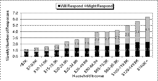
Source: HDS Diary Sample, FY 2011.
Introduction
This chapter
examines periodicals sent to households. Periodical Mail consists of newspapers
or magazines regularly sent to households, usually as part of a subscription.
This chapter analyzes only periodicals delivered by the Postal Service to
households. Newspapers or magazines delivered by a local carrier or purchased
at a newsstand or store are not included in Household Diary Study data. The
volumes examined here are only a portion of the total periodicals volume, since
some of periodicals are received by non-households, such as doctors’ offices or
other businesses.
The Internet has become an
increasingly accepted substitute
for hard-copy publications.
The
Periodicals Market
Historically, Periodical
Mail volume has not kept pace with population growth, as seen in Figure 6.1. Since
the 1990s, as demographics changed, people began to read less than they did a
few decades ago. Periodical volumes reached a peak in 1990 at 10.7 billion
pieces, but have declined each year since then, with the exception of FY 2000.
In that year, periodical volumes were temporarily buoyed by an influx of
advertising revenue during the dot-com boom.
After the recession
that began in 2001, periodicals volumes slipped not only because of reduced
subscriptions, but also because of the number of publications that ceased
operation as their sources of advertising revenue dried up. Since then, in
addition to a general demographic shift away from reading, periodicals’ volume
continued to decline as the Internet became an increasingly accepted substitute
for hard-copy publications. Since 2008, the decline was further aggravated by
the impact of the severe recession and a weak recovery.
Advertising’s
Impact on Periodicals
Advertising
spending translates into advertising revenue, and the key determinant of periodicals
profitability is advertising revenue.
Advertising is a
form of business investment. As with other investments, when the economy takes
a turn for the worse, advertising tends to slow. By 2000, total advertising as
a percent of Gross Domestic Product (GDP) rose to a historically high level;
when the high-tech bubble burst, advertising crashed. In 2002, albeit at a
slower pace, total advertising spending resumed its growth, and, after six
years of economic expansion, reached a new record high. After 2006, however,
advertising spending suffered its largest decline in history and, by 2009, fell
more than 20 percent. Since 2010,,advertising spending increased 6.3 percent,
aided by a slow economic recovery.
Magna Advertising
Group projects that advertising spending will continue to grow, starting with a
2.4 percent increase in 2012. As the economy continues to recover, it typically
would encourage advertising spending, which, in turn, should bode well for
magazines. More magazines in circulation would translate into higher volume for
the Postal Service, since, for most titles, the mail remains the primary
distribution channel. The Internet, however, has become a strong competitor of
hard-copy publications. The Internet provides an alternative channel for news,
information, and entertainment. As a consequence, periodical volumes may be
headed toward long-term decline, regardless of the state of the economy.
Figure 6.2 shows
the sharp decline in real per capita advertising spending for magazines that
started in 2001 due to the recession. Annual spending growth resumed in 2004
but only lasted two years. The recession, which started in 2007, sent magazine
advertising plummeting to the lowest level in a decade, drastically shrinking
the revenues and profitability of the magazine industry. In 2010 spending
remained constant but in 2011 it resumed the decline.
Household
Periodicals Volume
As shown in Table
E.2 of the Executive Summary, periodicals represent 3.9 percent of all
household mail volumes. Table E.2 also shows that the volume of periodicals continued
to decline over the past three years. In FY 2011, households received 5.4
billion periodicals, compared to 5.5 billion in FY 2010 and 6.0 in FY 2009.
Table 6.1 shows
the breakdown of periodicals received by households. Seventy-eight percent of all
periodicals received by households were magazines. In contrast, in 1987, the
share of magazines was 59 percent.
In 2011,
households received an average of 0.7 magazines per week. The most common type
of magazine is monthly, accounting for 57 percent of total magazines.
Newspapers make up
11 percent of total periodicals volume, down from a 35 percent share in 1987.
The number of newspapers received per household each week declined from 0.6 in
1987 to only 0.1 in 2011, while magazines only declined from 1.0 to 0.7 pieces
per week.
The decline in
newspapers captured in the Household Diary Study mirrors the behavior seen in
overall newspaper circulation.
As shown in Figure
6.3, newspaper circulation in general has declined significantly since 1990. Of
course, on a per capita basis, the decline is even more pronounced.
Table
6.1:
Periodical Type by Year
(Pieces per
Household per Week)
|
Periodical
Type
|
1987
|
2010
|
2011
|
|
Newspapers
|
.6
|
.2
|
.1
|
|
Daily
|
.2
|
.0
|
.0
|
|
Weekly
|
.3
|
.1
|
.1
|
|
Other
|
.1
|
.0
|
.0
|
|
Magazines
|
1.0
|
.7
|
.7
|
|
Weekly
|
.3
|
.1
|
.1
|
|
Monthly
|
.6
|
.4
|
.4
|
|
Other
|
.1
|
.1
|
.1
|
|
Unclassified
|
.1
|
.1
|
.1
|
|
Total
Periodicals
|
1.7
|
.9
|
.9
|
Source: HDS Diary Sample, FY 1987, 2010, and 2011.
Note: Totals may not sum due to
rounding.
Figure
6.3:
Newspaper Circulation, 1970-2009*

Source: Newspaper Association of America.
* InformationiIs only available through
2009.
Figure
6.4:
Daily Newspaper Readership, 1987-2011

Source:
Newspaper Association of America.
Note: There was a change in methodology
in 1998.
Directly contributing to newspaper volume
declines are changes in daily readership levels. As shown above in Figure 6.4,
the percentage of the U.S. population reading newspapers on any given day
decreased from 65 percent in 1987 to only 44 percent in 2011, after a slight
increase in 2010.
Daily
newspaper readership overall
has declined significantly since 1987.
Declining newspaper readership and
circulation are not the only contributors to the falling volume of newspapers
received via mail by households. With current technology and alternate delivery
systems, national newspapers, such as the Wall
Street Journal and The New York Times, deliver their papers
to prime urban and suburban household customers before breakfast. Local
printing/ distribution and morning delivery mean these copies of these
publications no longer move through the mail.
Periodicals Mail and
Household Characteristics
Income, Education, and Age
Table 6.2 shows that as income and education
increase, periodicals volume tends to increase. Households in which the head of
the household has a college education receive the most periodicals, averaging 1.1
per week. Similarly, households with an income above $100,000 receive an
average of 1.4 periodicals per week, almost three times what households earning
less than $35,000 receive.
Households
with incomes above $100,000
receive almost three times as many periodicals as households earning less than
$35,000.
Table 6.3 shows periodicals volume by age and
income. The higher the income and age of the household, the higher the volume
of periodicals received. For households whose heads are under 34 years old and
with incomes less than $35,000, the average is only 0.3 pieces per week.
Households with income above $100,000 and whose heads are over 55 receive the
most periodicals, with almost two pieces per week.
Table 6.2:
Periodicals by Income and Education
(Pieces per Household per Week)
|
Household Income
(Thousands)
|
Educational
Attainment of Head of Household
|
Average
|
|
Less than
High School
|
High School Graduate
|
Some College or Technical
School
|
College Graduate
|
|
Under $35
|
.4
|
.5
|
.6
|
.6
|
.5
|
|
$35 to $65
|
.5
|
.8
|
.6
|
.9
|
.7
|
|
$65 to $100
|
.7
|
.9
|
1.0
|
1.0
|
1.0
|
|
Over $100
|
1.7
|
1.3
|
1.1
|
1.5
|
1.4
|
|
Average
|
.5
|
.8
|
.8
|
1.1
|
.9
|
Source:
HDS Diary Sample, FY 2011.
Table 6.3:
Periodicals by Income and Age
(Pieces per Household per Week)
|
Household Income
(Thousands)
|
Age
of Head of Household
|
Average
|
|
Under 34
|
35 to 54
|
Over 55
|
|
Under $35
|
.3
|
.3
|
.7
|
.5
|
|
$35 to $65
|
.4
|
.6
|
1.0
|
.7
|
|
$65 to $100
|
.6
|
.9
|
1.3
|
1.0
|
|
Over $100
|
1.0
|
1.3
|
1.9
|
1.4
|
|
Average
|
.5
|
.8
|
1.1
|
.9
|
Source:
HDS Diary Sample, FY 2011.
Household Size
Table 6.4 and
Table 6.5 show that as households increase in size from one to two persons,
periodicals volume increases. Households with more than two persons receive
slightly fewer periodicals than two-person households. In households with two
adults, periodicals volume is higher than in one-person households, but the
presence of additional adults beyond two has no significant effect on receiving
periodicals.
Table
6.4:
Periodicals by Size of Household
(Pieces per
Household per Week)
|
Household
Size
|
|
|
One person
|
.6
|
|
Two
|
1.0
|
|
Three
|
.8
|
|
Four
|
.9
|
|
Five or more
|
.9
|
|
Average
|
.9
|
Source: HDS Diary Sample, FY 2011.
Table
6.5:
Periodicals by Number of Adults in Household
(Pieces per
Household per Week)
|
Number
of Adults
|
|
|
One
|
.6
|
|
Two
|
.9
|
|
Three or more
|
1.0
|
|
Average
|
.9
|
Source: HDS Diary Sample, FY 2011.
Internet
Access
As with many other
types of mail, wired households receive more periodicals through the mail, as
shown in Table 6.6. And, as with those other types of mail, this is largely the
result of the correlation between income, education, and Internet access (see
Table 6.7). As households’ access to the Internet and Broadband becomes more
widespread, even more periodical content will be delivered electronically,
rather than by mail. More recently, the emergence of portable electronic
devices (such as e-readers) designed primarily for reading digital books and
periodicals may have contributed to the reduction in the number of periodicals
moving through the mail.
Table
6.6:
Periodicals by Type of Internet Access
(Pieces per
Household per Week)
|
Type of Internet Access
|
|
|
Broadband
|
.9
|
|
Dial-up
|
.9
|
|
None
|
.7
|
|
Average
|
.9
|
Source: HDS Diary Sample, FY 2011.
Table 6.7:
Income and Education by Type of Internet Access
|
Type of
Internet Access
|
Median
Income
|
%
w/ College Degree
|
|
Broadband
|
67,538
|
43%
|
|
Dial-up
|
51,080
|
27%
|
|
None
|
23,139
|
12%
|
Source: HDS Diary Sample, FY 2011.
Subscription Type
Figure 6.5
provides an overview of subscription type for FY 1987, FY 2010, and FY 2011. As
shown, the distribution of subscription type has remained relatively stable
over the last two years and similar to the 1987 distribution. In 2011, a household
member ordered and paid for 44 percent of total periodicals sent to households.
An additional 35 percent were free—either ordered by a household member or
delivered to the household without a freestanding order, for example, as a
prerogative of membership in a professional, fraternal, or religious
organization.
Figure
6.5:
Subscription Type by Year
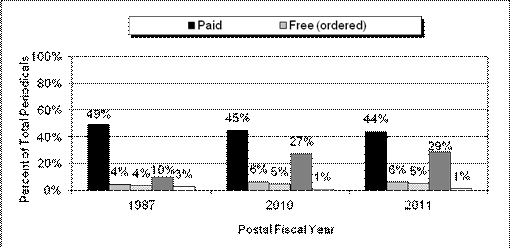
Source: HDS Diary Sample, FY 1987, 2010, and 2011.
Base: Total Periodicals Mail volume –
RPW.
Note: Percentages do not add to 100 due
to the exclusion of periodicals sent to non-households and those to
which no response was given as to subscription type.
Table
6.8:
Periodicals by Sender Type
|
Sender
Type
|
Pieces
per Household
per Week
|
Percent
of Periodicals Received by HH
|
|
Commercial Organization
|
.71
|
82%
|
|
Professional Organization
|
.06
|
7%
|
|
Religious Organization
|
.03
|
3%
|
|
Educational Organization
|
.03
|
3%
|
|
Union
|
.01
|
2%
|
|
Charitable Organization
|
.01
|
1%
|
|
Veterans’ Organization
|
.01
|
1%
|
|
Unclassified
|
.01
|
2%
|
|
Total
|
.87
|
100%
|
Source: HDS Diary Sample, FY 2011.
Volume Drivers
A number of
factors influence a household’s receipt of periodicals. Several of these
variables are demographic, while others are more behavioral in nature. In the
past, income seemed to influence volume strongly, since periodicals are usually
received through a paid subscription.
Typically,
higher-income households subscribe to more magazines and newspapers. In 2011, the
number of periodicals per household continued a long-term decline for the
lower- and middle-income groups, but, more recently, it increased for the
higher-income group, as shown in Figure 6.6
Introduction
This chapter discusses packages
sent and received by households. Packages can be mailed via the U.S. Postal
Service at a variety of rates; for example, documents are usually sent as
First-Class Mail, Priority Mail, or Express Mail, while product samples are
generally sent as Standard Mail.
The Package Market
The package delivery market is an important segment of the
economy. Between 2001 and 2007, the total volume increased 8 percent. However, starting
with 2008, packages declined with the economy and the severe recession. After
falling 11 percent by the end of 2009, total package volume recovered and
increased almost 7 percent from 2009 to 2011. Over that time, however, the
segments of the market performed differently.
There are three major segments of the package market:
·
Overnight air,
·
Two- and three-day air, and
·
Ground.
The U.S. Postal Service is a major player in the two- and
three-day air segment but provides services in all: Express Mail in the
overnight segment, Priority and First-Class Mail in the two- and three-day
segment, and Standard Mail and Package Services in the ground segment.
Table 7.1 on the next page shows the volume and growth
rates of the three segments of the package delivery market. Between the early
1980s and 2000, the overall market grew, driven by growth in the overnight and
in the two-day and three-day air segments. This growth was largely because of
the expansion of services offered by United Parcel Service (UPS) and Federal
Express (FedEx). UPS began to push strongly into the overnight market, and both
UPS and FedEx developed new two- and three-day offerings to compete with
Priority Mail.
The 2001 recession led to declines in all segments of the
package market, with the largest effect in the two- and three-day air segment
as customers shifted to time-guaranteed ground service in the face of hard
economic times. The slow recovery in 2002 continued to adversely affect all
segments of the package market, except for ground. Ground began to pick up in
2002 at the expense of the other segments. This pattern continued through 2004.
As a result, the ground segment accounts for more of the package market by
volume than it has at any point over the last 10 years (see Figure 7.1 on the
next page). In 2005 and 2006, the recovering economy and the emergence of
e-commerce boosted all segments of the package market. Starting in 2007,
however, the instability of fuel prices and the recession that followed
contributed to decreases in all markets. The overnight market was hit
particularly hard in this recession. Since 2007, overnight volume has declined
23 percent. In 2011, all market segments improved sufficiently to end the year
with positive growth.
In 2011,
package volume increased 4.5 percent to 8.1 billion pieces.
While many carriers serve the package delivery market,
FedEx, UPS, and the U.S. Postal Service are the largest players.
Table
7.1:
Total Package Market Volume Growth
(Units in Millions)
|
Fiscal Year
|
Overnight Air
|
Two- & Three-Day
Air
|
Ground
|
Total
|
|
|
|
Volume
|
Percent Growth
|
Volume
|
Percent Growth
|
Volume
|
Percent Growth
|
Volume
|
Percent Growth
|
|
|
2001
|
1,126
|
-2.90%
|
2,135
|
-4.10%
|
4,555
|
-0.40%
|
7,815
|
-1.80%
|
|
|
2002
|
1,063
|
-5.60%
|
1,980
|
-7.30%
|
4,578
|
0.50%
|
7,621
|
-2.50%
|
|
|
2003
|
1,062
|
-0.10%
|
1,842
|
-7.00%
|
4,737
|
3.50%
|
7,642
|
0.30%
|
|
|
2004
|
1,044
|
-1.70%
|
1,873
|
1.70%
|
4,931
|
4.10%
|
7,848
|
2.70%
|
|
|
2005
|
1,055
|
1.10%
|
1,931
|
3.10%
|
5,107
|
3.60%
|
8,094
|
3.10%
|
|
|
2006
|
1,071
|
1.50%
|
2,010
|
4.00%
|
5,253
|
2.90%
|
8,333
|
3.00%
|
|
|
2007
|
1,051
|
-1.80%
|
1,966
|
-2.20%
|
5,438
|
3.50%
|
8,455
|
1.50%
|
|
|
2008
|
997
|
-5.20%
|
1,869
|
-4.90%
|
5,527
|
1.60%
|
8,393
|
-0.70%
|
|
|
2009
|
828
|
-17.00%
|
1,734
|
-7.20%
|
5,052
|
-8.60%
|
7,613
|
-9.30%
|
|
|
2010
|
810
|
-2.20%
|
1,721
|
-0.70%
|
5,225
|
3.40%
|
7,756
|
1.90%
|
|
|
2011
|
816
|
0.80%
|
1,810
|
5.10%
|
5,481
|
4.90%
|
8,107
|
4.50%
|
|
Source:
UPS, FedEx, and U.S. Postal Service data, Colography Group.
Figure
7.1:
Package Delivery Market Segment Share
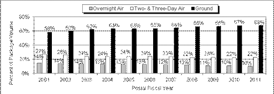
Source: UPS, FedEx, and U.S. Postal Service data,
Colography Group.
Postal Service Package Volume
Compared to other mail, like letters and flats, the number
of packages captured in the Household Diary Study is small, as most people do
not receive packages on a regular basis. The interpretation of the results
should be conducted with this in mind.
Postal Service package volume sent and received by
households increased thirteen percent in FY 2011 over 2010, after remaining
virtually unchanged between 2009 and 2010.
Households received 3.0 billion
packages in FY 2011 and sent 1.1 billion, as seen in Table 7.2. When the
combined volumes, excluding Standard, are compared to FY 2009, packages
(shipped via First-Class or Package and Shipping Services) sent and received by
households increased 16 and 12 percent respectively in FY 2011. First-Class packages sent and received
increased by 13 percent compared to 2009, driven by growing CD/DVD rentals.
Standard Mail packages increased almost 15 percent compared to 2009.
Table
7.2:
Postal Service Sent and Received Packages, FY 2009, 2010, and 2011
(Units in Millions)
|
Mail Classification
|
Volume (Millions
of Pieces)
|
|
2009
|
2010
|
2011
|
|
Sent
|
Received
|
Sent
|
Received
|
Sent
|
Received
|
|
First-Class
|
814
|
1,300
|
803
|
1,245
|
969
|
1,424
|
|
Standard
Mail
|
—
|
583
|
—
|
620
|
—
|
667
|
|
Package
& Shipping Services
|
144
|
802
|
172
|
808
|
143
|
920
|
|
Unclassified
|
0
|
0
|
0
|
0
|
0
|
2
|
|
Total Packages
|
958
|
2,685
|
975
|
2,673
|
1,112
|
3,013
|
|
Mail Classification
|
Percent of Pieces
|
|
2009
|
2010
|
2011
|
|
Sent
|
Received
|
Sent
|
Received
|
Sent
|
Received
|
|
First-Class
|
85%
|
48%
|
82%
|
47%
|
87%
|
47%
|
|
Standard
Mail
|
—
|
22%
|
—
|
23%
|
—
|
22%
|
|
Package
& Shipping Services
|
15%
|
30%
|
17%
|
30%
|
13%
|
30%
|
|
Unclassified
|
0%
|
0%
|
0%
|
0%
|
0%
|
0%
|
|
Total Packages
|
100%
|
100%
|
100%
|
100%
|
100%
|
100%
|
Source: HDS Diary Sample, FY 2009, 2010, and 2011.
Notes: First-Class Packages include 1.6 billion pieces of CD/DVD rentals sent
and received reported in First-Class Mai
letters in Tables E.1, 1.5,and 1.6.
Percentages may not sum to 100 due to rounding.
Totals include approximately 300 million pieces of household-to-household
packages that are counted in both sent and received.
Packages and
Household Characteristics
Income, Education, and Age
According to the HDS, high-income households
sent and received more packages than their less affluent counterparts in FY 2011,
as shown in Figure 7.2.
In fact, households in the highest income
bracket received more than three times the number of packages received by
households with incomes below $35,000. The highest income households also sent
over two times as many packages as the lowest income households. For the two
higher income categories, households headed by younger people on average
received more packages than those with heads of household over 55 years old, as
shown in Table 7.3. This may be the case because young heads of households make
more online purchases than those who are older. When it comes to sending
packages, Table 7.4 shows younger households, in all cases, again sent
significantly more packages than the older household group.
Figure 7.2:
Postal Service Sent and Received Packages by Household Income
(Pieces per Household per
Week)
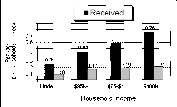
Source: HDS Diary Sample, FY 2011.
Base: Packages Sent and Received by
Households and Delivered by
U.S. Postal Service.
Table 7.3:
Postal Service Received Packages by Income and Age
(Pieces per Household per Week)
|
Household Income
(Thousands)
|
Age of Head of
Household
|
Average
|
|
Under 35
|
35 to 54
|
Over 55
|
|
Under $35
|
.20
|
.26
|
.24
|
.25
|
|
$35 to $65
|
.34
|
.43
|
.52
|
.44
|
|
$65 to $100
|
.64
|
.55
|
.59
|
.59
|
|
Over $100
|
.91
|
.75
|
.69
|
.76
|
|
Average
|
.49
|
.52
|
.45
|
.49
|
Source: HDS Diary Sample, FY 2011.
Table
7.4:
Postal Service Sent Packages by Income and Age
(Pieces per Household per Week)
|
Household Income
(Thousands)
|
Age of head of
Household
|
Average
|
|
Under 35
|
35 to 54
|
Over 55
|
|
Under $35
|
.08
|
.17
|
.06
|
.10
|
|
$35 to $65
|
.15
|
.28
|
.10
|
.17
|
|
$65 to $100
|
.19
|
.22
|
.16
|
.19
|
|
Over $100
|
.21
|
.24
|
.17
|
.21
|
|
Average
|
.15
|
.22
|
.11
|
.16
|
Source: HDS Diary Sample, FY 2011.
The Household Diary Study indicates that households whose
heads have college degrees tend to receive and send more packages on average
than households with lower educational attainment. These results are shown in
Tables 7.5 and 7.6.
Table 7.5:
Postal Service Received Packages by Income and Education
(Pieces per Household per Week)
|
Household Income
(Thousands)
|
Education
of Head of Household
|
Average
|
|
Less than
High School
|
High School Graduate
|
Some College or Technical
School
|
College Graduate
|
|
Under $35
|
.10
|
.22
|
.32
|
.49
|
.25
|
|
$35 to $65
|
.22
|
.38
|
.50
|
.54
|
.44
|
|
$65 to $100
|
.56
|
.52
|
.55
|
.65
|
.59
|
|
Over $100
|
.48
|
.85
|
.67
|
.77
|
.76
|
|
Average
|
.22
|
.39
|
.49
|
.66
|
.49
|
Source:
HDS Diary Sample, FY 2011.
Table
7.6:
Postal Service Sent Packages by Income and Education
(Pieces per Household per Week)
|
Household Income
(Thousands)
|
Education of
Head of Household
|
Average
|
|
Less than
High School
|
High School Graduate
|
Some College or Technical
School
|
College
Graduate
|
|
Under $35
|
.05
|
.09
|
.15
|
.12
|
.10
|
|
$35 to $65
|
.00
|
.12
|
.23
|
.24
|
.17
|
|
$65 to $100
|
.01
|
.23
|
.16
|
.22
|
.19
|
|
Over $100
|
.00
|
.12
|
.12
|
.26
|
.21
|
|
Average
|
.04
|
.13
|
.16
|
.23
|
.16
|
Source: HDS Diary Sample, FY 2011.
Household Size
The Household Diary Study shows
that larger households tend to receive and send more packages than smaller
households, as shown in Table 7.7.
Table
7.7:
Postal Service Received and Sent Packages
by Size of Household
(Pieces per Household per Week)
|
Household Size
|
Received
|
Sent
|
|
One
person
|
.36
|
.12
|
|
Two
|
.50
|
.18
|
|
Three
|
.51
|
.13
|
|
Four
|
.61
|
.20
|
|
Five
or more
|
.48
|
.17
|
|
Average
|
.49
|
.16
|
Source: HDS Diary Sample, FY 2011.
Table
7.8:
Postal Service Received and Sent Packages
by Number of Adults in Household
(Pieces per Household per Week)
|
Number of
Adults
|
Received
|
Sent
|
|
One
|
.35
|
.12
|
|
Two
|
.52
|
.19
|
|
Three
or more
|
.58
|
.11
|
|
Average
|
.49
|
.16
|
Source:
HDS Diary Sample, FY 2011.
Internet
Access
Access
to the Internet seems to play an important part in determining the number of
packages sent and received by households. Table 7.9 shows the packages sent and
received by households with and without Internet access. In FY 2011, households
with Broadband sent more than six times and received almost two times as many
packages as households without Internet access. These relationships probably
reflect the correlation between income, education, and Internet access, as
shown in Table 7.10.
In FY 2011, households
with Internet access sent and received more packages than households without
Internet access.
Table
7.9:
Received and Sent Packages
by Household Internet Access
(Pieces per Household per Week)
|
Type of
Internet Access
|
Received
|
Sent
|
|
Broadband
|
.55
|
.19
|
|
Dial-up
|
.51
|
.13
|
|
None
|
.21
|
.03
|
|
Average
|
.49
|
.16
|
Source: HDS Diary Sample, FY 2011.
Table 7.10:
Income and Education by Type of Internet Access
|
Type of
Internet Access
|
Median
Income
|
%
w/ College Degree
|
|
Broadband
|
67,538
|
43%
|
|
Dial-up
|
51,080
|
27%
|
|
None
|
23,139
|
12%
|
Household Package Contents
As shown in Table 7.11, packages received by households
most often contain music/videos, pharmaceuticals, books, and clothes—a sign
that online purchases and mail-order
retail are the primary drivers of household package volume.
In fact, online purchases contributed to a significant
growth in music/video contents received. The share of this type of content remained
very strong in 2011, at almost 40 percent of all contents, primarily because of
volumes generated by video rental outfits like Netflix.
Households most often send music
and videos, clothes, books, and toys. Primarily, this is due to the higher
volume of household packages sent during the holiday season, but it may also be
evidence of the growing use of online sales and auction portals, such as eBay.
Table
7.11:
Contents of Postal Service Sent and Received Packages
|
Contents
|
Volume (Millions of Pieces)
|
|
2009
|
2010
|
2011
|
|
Sent
|
Received
|
Sent
|
Received
|
Sent
|
Received
|
|
Music/Video
|
750
|
1,040
|
734
|
983
|
906
|
1,154
|
|
Pharmaceuticals/Contacts
|
6
|
254
|
6
|
245
|
2
|
306
|
|
Books
|
34
|
295
|
31
|
233
|
29
|
290
|
|
Clothing
|
32
|
173
|
59
|
231
|
45
|
278
|
|
Household/Kitchen/Lawn
and garden products
|
24
|
93
|
16
|
111
|
33
|
188
|
|
Electronic
equipment
|
26
|
61
|
21
|
72
|
16
|
90
|
|
Toys
|
16
|
57
|
13
|
45
|
31
|
71
|
|
Cosmetics/Beauty
products/Toiletries
|
3
|
94
|
15
|
85
|
5
|
67
|
|
Checkbooks
|
0
|
49
|
0
|
60
|
0
|
59
|
|
Food
Products
|
2
|
67
|
3
|
49
|
0
|
54
|
|
Computer
hardware, software, or accessories
|
8
|
35
|
10
|
38
|
13
|
53
|
|
Photos/Film
|
3
|
40
|
1
|
38
|
0
|
34
|
|
Travel
products and information
|
3
|
21
|
3
|
33
|
4
|
24
|
|
Other
Contents
|
54
|
481
|
74
|
519
|
36
|
564
|
|
Total Packages
|
958
|
2,685
|
975
|
2,673
|
1,112
|
3,013
|
Table
7.11:
Contents of Postal Service Sent and Received Packages (cont.)
|
Contents
|
Percent of Pieces
|
|
2009
|
2010
|
2011
|
|
Sent
|
Received
|
Sent
|
Received
|
Sent
|
Received
|
|
Music/Video
|
78%
|
39%
|
75%
|
37%
|
81%
|
38%
|
|
Pharmaceuticals/Contacts
|
1%
|
9%
|
1%
|
9%
|
0%
|
10%
|
|
Books
|
4%
|
11%
|
3%
|
9%
|
3%
|
10%
|
|
Clothing
|
3%
|
6%
|
6%
|
9%
|
4%
|
9%
|
|
Household/Kitchen/Lawn
and garden products
|
3%
|
3%
|
2%
|
4%
|
3%
|
6%
|
|
Electronic
equipment
|
3%
|
2%
|
2%
|
3%
|
1%
|
3%
|
|
Toys
|
2%
|
2%
|
1%
|
2%
|
3%
|
2%
|
|
Cosmetics/Beauty
products/Toiletries
|
0%
|
4%
|
1%
|
3%
|
0%
|
2%
|
|
Checkbooks
|
0%
|
2%
|
0%
|
2%
|
0%
|
2%
|
|
Food Products
|
0%
|
3%
|
0%
|
2%
|
0%
|
2%
|
|
Computer
hardware, software, or accessories
|
1%
|
1%
|
1%
|
1%
|
1%
|
2%
|
|
Photos/Film
|
0%
|
1%
|
0%
|
1%
|
0%
|
1%
|
|
Travel
products and information
|
0%
|
1%
|
0%
|
1%
|
0%
|
1%
|
|
Other
Contents
|
6%
|
18%
|
8%
|
19%
|
3%
|
19%
|
|
Total Packages
|
100%
|
100%
|
100%
|
100%
|
100%
|
100%
|
Source: HDS Diary
Sample, FY 2009, 2010, and 2011.
Notes:
Contents questions are multiple response; total packages does not include
multiple contents and, as such,
does not equal the sum for each column.
Does not include contents for which no answer was given (DK/RF).
Music/Video packages include 1.7 billion pieces of CD/DVD rentals sent and
received, reported in
First-Class Mail letters in Tables E.1, 1.5, and 1.6
Study Design and Methodology
The U.S. Postal Service Household Diary
Study (HDS), conducted by NuStats on behalf of the Volume and Revenue
Forecasting division of the Postal Service’s Finance Department, is a
continuously fielded study that measures household mail volumes, mail usage,
and attitudes about the mail and advertising.
The HDS uses a two-stage survey design:
Stage 1 is an interviewer-mediated household recruitment interview. Stage 2 is
a self-completion mail diary [Appendix C contains the survey instruments]. The
HDS uses a multi-mode approach to minimize response bias, to improve data accuracy
through efficient data checking and household re-contacts, and to provide
immediate telephone assistance to participants during their diary week.
Household
Recruitment Interview
The
household recruitment interview
collects information on household and individual demographics, recall of mail
sent and received, adoption and use of communications technologies, bill
payment behavior, and attitudes towards advertising.
The mail diary covers a seven-day
period (Monday to Sunday) and collects information on the number of mail pieces
received and sent, industry source, mail characteristics, and attitudes
regarding mail received.
Sample
Design
This section describes the household
selection process for participation in the HDS. A sample is the representative
subset of the survey population used to gain information about the entire
population. The population of inference for the HDS is all U.S. households. The
probability design ensures each household has an equal chance of selection.
The sample design allows projections of
results to all U.S. households. The Postal Service provided an address sample
that NuStats matched for known telephone listings. Generally, the study was
conducted using telephone sampling for household selection and screening,
followed by diaries mailed to eligible households and completed by each
household unit. Households without telephones were contacted via U.S. Mail. The
sample design involves a systematic sample stratified by strata (or urban/rural
location) and Census regions, ensuring even coverage across the United States.
A master national sample was specified and
drawn by in-house sampling statisticians. The Postal Service drew the household
probability sample from the national address database following NuStats
specifications. The master list, sorted by ZIP code, was used to draw a
systematic stratified sample, which was then tagged with variables indicating
each housing unit’s geographic location in terms of Census region and stratum.
Sample was drawn for each of the four
quarters based on known proportions of households within a Census region and
urban or rural location. Census regions are defined by state. Urban and rural
location is defined by county and metropolitan status as defined by the U.S.
Census Bureau. The strata are defined by county as follows:
·
Stratum
1: Counties that are part of the 30 largest metropolitan areas in the
United States, as defined by population, according to 100 percent counts of the
Census 2010.
·
Stratum
2: Counties that are part of metropolitan areas but are not in Stratum
1.
·
Stratum
3: Counties that are not part of a metropolitan area.
Quarterly sample frames were then derived
based on the amount of sample needed for each quarter, and sample was allocated
to region and strata cells based on known proportions as indicated by Census 2010
counts of households.
The sample was continuously “fielded”
throughout all 52 weeks of the year. Sample was released in a manner designed
to recruit equal sample sizes for each diary week, resulting in a sample file
of at least 5,200 households. Table B.1 below shows the distribution of
recruited and completed households.
Table
B.1:
Sample by Postal Quarter
|
Quarter
|
Required
Sample
|
Recruited
Households
|
Completed
Households
|
|
Quarter 1
|
1,300
|
2,005
|
1,320
|
|
Quarter 2
|
1,300
|
1,999
|
1,281
|
|
Quarter 3
|
1,300
|
2,038
|
1,308
|
|
Quarter 4
|
1,300
|
1,979
|
1,291
|
|
Total
|
5,200
|
8,021
|
5,200
|
Data Collection Method
The study uses a two-stage design in which households are
recruited to participate in the diary study in a household interview (Stage 1)
and recruited households complete a seven-day diary of mail received and sent
(Stage 2).
Stage 1: Household
Recruitment Interview
The main function of the household recruitment interview
is to recruit households to participate in the diary study. In addition, the
interview collects information on household and person demographics, recall of
mail sent and received, adoption and use of communication technologies, bill
payment behavior, and attitudes towards advertising.
Households completed the recruitment interview via
computer-assisted telephone interviewing (CATI) technology. The FY 2011 household
interview consisted of 8,021 completed interviews with an adult member (age 18
or older) in the household. These respondents represented a cross-section of
U.S. households by geography. The household interview contained 130 data items
and took an average of 25 minutes to administer. The flow of the interview
included the following elements:
·
Introduction.
Each interview began with an introduction and purpose of the interview. The
interviewer also verified the respondent’s address.
·
Technology
adoption and use. Questions were asked about ownership and use of
personal computers, Internet, and other electronic communication.
·
Mail
volume recall. The respondent was asked to summarize how many personal
letters, greeting cards, electronic greeting cards, and packages all members of
the household have sent in a particular time period.
·
Use
of postal services. The use of post offices, post office boxes, and
private mailing services was explored.
·
Bill
payments. Bill payment volumes, methods, and timing were explored in
depth.
·
Periodicals.
A summary of magazine and newspaper volumes received by the household were
collected.
·
Advertising.
Descriptions of advertising received by the household as well as attitudes
about the advertising, and orders placed because of it, were elicited.
·
Online
shopping. Respondents were asked about their online shopping habits,
including questions about shipping methods.
·
Financial
accounts and credit cards. Respondents were asked to summarize the
total accounts and credit cards held by the household.
·
Household
and person demographics. Demographic items included gender, age,
marital status, employment status, educational attainment, race/ethnicity,
household income, household wage earners, home ownership, residence tenure, and
dwelling type.
The completion rate
for the FY 2011 study (defined as the proportion of respondents who completed
the diary portion relative to all recruited respondents) was 64.8 percent. This
represents a decrease of 2.4 percent from 2010. Most recruitment refusals took
place prior to hearing who NuStats was and why the firm was calling. Refusal households that were later re-contacted
cited time constraints and privacy concerns as reasons for not
participating.
Stage 2: Mail Diary
Package
Recruited households were sent mail diaries, instructions,
and a toll-free “help” telephone number. The night before the beginning of an
assigned diary week, NuStats made reminder calls to households to confirm
receipt of the diary package and to answer any questions. If the diary package
was not received by this time, NuStats re-confirmed the address, assigned a new
diary week, and re-sent the diary package.
The diary package contains a Certificate of Appreciation,
Instruction Booklet, and a photo-based “Quick Start” sheet. The Instruction
Booklet provided information about the study, answers to frequently asked
questions, instructions for filling out the diary, guidelines for sorting mail,
and examples of mail markings.
The diary instrument was composed of two parts:
·
The
Question sheets. The Question sheets are color-coded by mail
classification (First-Class Mail received, First-Class Mail sent, Standard,
Nonprofit, etc.). Information collected about each mail classification
included: type of mail piece (i.e., envelope, postcard, catalog), receiver ZIP
code, sender ZIP code, mail classification, mail type, sender type, information
about advertising enclosed, and receiver reaction or responses to the mail
piece.
·
Seven
answer booklets, each specific to a day of the week. Each booklet was
arranged by mail classification and color-coded to correspond to the question
sheets.
Households were instructed to enclose pertinent information
from each mail piece received to enable NuStats editors to verify or clarify
quantity and classes of mail recorded in the diaries. NuStats used a
three-stage editing process to check the accuracy of the diary information
recorded by each household. First, returned diary packages were culled for
those that represented a reasonable attempt to complete the diary. Second, the
diary information recorded for each day were checked to ensure sufficient and
logical answers, as well as to verify recorded information against the mail
markings returned in the package. The diaries were then scanned using Optical
Character Recognition (OCR) software. In stage three, a verifier re-checked the
diary information recorded in the OCR software for each day. This second edit
functions as a quality control check to ensure data accuracy.
During the editing process, a small number of correction
callbacks were made to households to clarify information or to fill-in missing
information. Overall, about three percent of returned diaries did not pass the
edit checking process.
Of the 8,021 households recruited to receive a diary
package, 5,200 actually returned acceptable completed diaries (defined as
containing data suitable for analysis) to NuStats, for a completion rate of 64.8
percent.
Data
Processing
Data Management
Data management entails processing the information
resulting from the Household Interview and Mail Diaries, making it available
for analysis, storing it, and documenting it. Household interviews were
conducted using CATI technology, where the questionnaire and relevant data
checks were programmed into a master questionnaire that was used by all
interviewers to administer the survey. Recorded data was extracted from the
CATI software into a database management file.
Returned diary information was recorded (entered) through
optical scanning technology. The diary data, once scanned using Teleform
software, was captured in a database management file.
After completion of data collection, editing and entry
tasks, the survey data were contained in 9 data files. One data file contained
the Household Interview data. The Mail Diary data were in 8 files—one for each
mail classification (First-Class Mail received, First-Class Mail sent, etc.).
These files were all developed in SAS-PC.
The file variables were identified by variable name. For
each file variable, the File Information contains:
·
Label, which is a brief description of the
variable;
·
Measurement level, which specifies the level of
measurement as scale (numeric data on an interval or ratio scale), ordinal, or
nominal. Nominal and ordinal data can be either string (alphanumeric) or
numeric;
·
Value formats, which identify the response
codes; and
·
Column width and alignment.
Several SAS programming operations were necessary to put
the Mail Diary data in the desired form for analysis. The structure for these
programs was contained in a separate File Information document that accompanied
the data delivery.
Various edit routines were used to check the consistency of
the reported data and to identify reporting or entry errors. Routine edit
checks were conducted to examine questionnaire responses for reasonableness and
consistency across items. Routine checks included such items as:
·
Response code range checks;
·
Checks for proper data skips and patterns of
answering questions consistent with prior answers;
·
Checks for realistic responses (e.g., number of
online purchases possible in one month); and
·
Checks for high frequency of item non-response
(missing data from question refusals).
When conducting these checks, data were compared against
the actual survey forms. NuStats identified extreme values that were impossible
or unlikely, and corrected inconsistent data when possible. For example,
extremely high numbers of computers owned by a household were examined to
determine whether or not they were legitimate.
Some extreme/inconsistent data values unable to be
corrected or verified were edited to missing values.
In addition, NuStats performed in-depth customized data
checks to ensure data within each record of the Household Interview were
logically consistent. For example, a respondent should have reported paying
bills online only if he/she also reported having Internet access. Customized
checks were also used to ensure consistency between the Household Interview and
Mail Diary data. For example, an addressee was identified as a child (under 18)
in the diary only if the household also reported having a child in the
Household Interview.
Raw variables, derived variables, and analytical programs
were documented in a data documentation binder that accompanied the data
delivery. Any information that could be directly or indirectly used to identify
individual respondents, such as respondent names, addresses, or telephone
numbers, were removed to protect respondent confidentiality and privacy. Such
information is stored in a locked archival file.
Sample
Demographic Profile (All Counts Unweighted),
Government Fiscal Year 2011
Table
B.2:
Annual Household Income by Recruitment/Retrieval Status
|
Annual
Household Income
|
Recruited
Households
|
Total
|
Sample Percent
|
Population
Percent
|
|
Retrieved
|
Not Retrieved
|
|
Under $10,000
|
146
|
233
|
379
|
3.3%
|
7.8%
|
|
$10,000 - $14,999
|
183
|
187
|
370
|
4.1%
|
5.9%
|
|
$15,000 - $19,999
|
189
|
150
|
339
|
4.2%
|
6.1%
|
|
$20,000 - $24,999
|
280
|
157
|
437
|
6.2%
|
5.8%
|
|
$25,000 - $34,999
|
388
|
218
|
606
|
8.7%
|
10.9%
|
|
$35,000 - $49,999
|
543
|
277
|
820
|
12.1%
|
13.9%
|
|
$50,000 - $64,999
|
617
|
282
|
899
|
13.8%
|
11.5%
|
|
$65,000 - $79,999
|
579
|
233
|
812
|
12.9%
|
8.8%
|
|
$80,000 - $99,999
|
543
|
221
|
764
|
12.1%
|
8.8%
|
|
$100,000 or more
|
1,014
|
420
|
1,434
|
22.6%
|
20.4%
|
|
Don't Know
|
135
|
135
|
270
|
N/A
|
N/A
|
|
Refused
|
583
|
308
|
891
|
N/A
|
N/A
|
|
Total
|
5,200
|
2,821
|
8,021
|
100.0%
|
100.0%
|
Notes:
Sample Percent based only on retrieved households that provided a response to
the Household Income question.
Population percent based on U.S. Census Bureau, Current Population Survey
Annual Demographic File (March 2011).
Table B.3:
Number of Adults in Household by Recruitment/Retrieval Status
|
Number of Adults
in Household
|
Recruited
Households
|
Total
|
Sample Percent
|
Population
Percent
|
|
Retrieved
|
Not Retrieved
|
|
One
|
1,262
|
817
|
2,079
|
24.3%
|
27.6%
|
|
Two
|
2,215
|
1,020
|
3,235
|
42.6%
|
33.5%
|
|
Three
|
788
|
402
|
1,190
|
15.2%
|
15.6%
|
|
Four
|
587
|
327
|
914
|
11.3%
|
13.4%
|
|
Five or More
|
348
|
255
|
603
|
6.7%
|
9.9%
|
|
Total
|
5,200
|
2,821
|
8,021
|
100.0%
|
100.0%
|
Notes:
Sample Percent based only on retrieved households.
Population percent based on U.S. Census Bureau, Current Population Survey
Annual Demographic File (March 2011).
Table
B.4:
Geographic Region by Recruitment/Retrieval Status
|
Geographic Region
|
Recruited
Households
|
Total
|
Sample Percent
|
Population
Percent
|
|
Retrieved
|
Not Retrieved
|
|
Northeast
|
897
|
552
|
1,449
|
17.3%
|
19.2%
|
|
Midwest
|
1,181
|
630
|
1,811
|
22.7%
|
23.4%
|
|
South
|
1,858
|
1,073
|
2,931
|
35.7%
|
36.0%
|
|
West
|
1,264
|
566
|
1,830
|
24.3%
|
21.3%
|
|
Total
|
5,200
|
2,821
|
8,021
|
100.0%
|
100.0%
|
Notes:
Sample Percent based only on retrieved households.
Population percent based on U.S. Census Bureau, Census 2010, Summary File 3,
Table H6 (Occupied Housing Units).
Table
B.5:
Urban/Rural Location by Recruitment/Retrieval Status
|
Urban/Rural Location
|
Recruited
Households
|
Total
|
Sample Percent
|
Population
Percent
|
|
Retrieved
|
Not Retrieved
|
|
30 Largest Metro Areas
|
2,597
|
1,416
|
4,013
|
49.9%
|
48.7%
|
|
Other Metro Areas
|
1,572
|
829
|
2,401
|
30.2%
|
29.9%
|
|
Non-Metropolitan Areas
|
1,031
|
576
|
1,607
|
19.8%
|
21.4%
|
|
Total
|
5,200
|
2,821
|
8,021
|
100.0%
|
100.0%
|
Notes:
Sample Percent based only on retrieved households.
Population percent based on U.S. Census Bureau, Census 2010; Strata based on
Metro Area Classification by County.
Table
B.6:
Age of Head of Household by Recruitment/Retrieval Status
|
Age of
Head of Household
|
Recruited
Households
|
Total
|
Sample Percent
|
Population
Percent
|
|
Retrieved
|
Not Retrieved
|
|
18 - 24
|
68
|
67
|
135
|
1.3%
|
5.1%
|
|
25 - 44
|
1,049
|
667
|
1,716
|
20.4%
|
34.8%
|
|
45 - 64
|
2,296
|
1,135
|
3,431
|
44.6%
|
38.6%
|
|
65+
|
1,737
|
921
|
2,658
|
33.7%
|
21.5%
|
|
Refused
|
50
|
31
|
81
|
N/A
|
N/A
|
|
Total
|
5,200
|
2,821
|
8,021
|
100.0%
|
100.0%
|
Notes:
Sample Percent based only on retrieved households that provided a valid
response.
Population percent based on U.S. Census Bureau, Current Population Survey
Annual Demographic File (March 2011).
Table
B.7:
Educational Attainment of Head of Household by
Recruitment/Retrieval Status
|
Educational Attainment of
Head of Household
|
Recruited
Households
|
Total
|
Sample Percent
|
Population
Percent
|
|
Retrieved
|
Not Retrieved
|
|
8th grade or less
|
56
|
82
|
138
|
1.1%
|
4.4%
|
|
Some high school
|
133
|
171
|
304
|
2.6%
|
7.7%
|
|
High school graduate
|
1,127
|
844
|
1,971
|
21.8%
|
29.6%
|
|
Some college
|
954
|
533
|
1,487
|
18.5%
|
18.6%
|
|
Technical school graduate
|
257
|
167
|
424
|
5.0%
|
4.4%
|
|
College graduate
|
1,541
|
625
|
2,166
|
29.8%
|
24.5%
|
|
Postgraduate work
|
1,097
|
377
|
1,474
|
21.2%
|
10.7%
|
|
Refused
|
35
|
22
|
57
|
N/A
|
N/A
|
|
Total
|
5,200
|
2,821
|
8,021
|
100.0%
|
100.0%
|
Notes:
Sample Percent based only on retrieved households that provided a valid
response.
Population percent based on U.S. Census Bureau, Current Population Survey
Annual Demographic File (March 2011).
Data Weighting and
Expansion
This section explains the methodology used for creating
sampling and expansion weights for the FY 2011 Household Diary Study.
The FY 2011 HDS uses both weighting and expansion factors
to 1) adjust the sample data to match population parameters and 2) expand mail
volumes exhibited in the diary sample to all U.S. households.
Weighting Procedures, FY 2011 Recruitment Data
Sampling weights were produced separately for the
households that participated in the recruitment phase of the FY 2011 HDS, and
those that completed and returned a diary. There were two main weighting
variables: Geography and Education. FY 2011 recruitment geographic weights were
derived from sample households’ strata and region:
Strata:
As mentioned previously, there are three strata. A household was classified
within strata as residing in the top 30 metropolitan areas nationwide, any
other metropolitan area, or a non-metropolitan area.
Table B.8 provides unweighted sample counts from FY 2011 recruitment data for
strata:
Table
B.8:
HDS 2011 Recruitment Data: Urban/Rural Location
|
Urban/
Rural Location
|
Household
|
Percent
|
Cumulative
Percent
|
|
30 Largest
Metro Areas
|
4,013
|
49.9%
|
49.9%
|
|
Other Metro Areas
|
2,401
|
30.2%
|
80.1%
|
|
Non-Metro Counties
|
1,607
|
19.8%
|
100.0%
|
|
Total
|
8,021
|
100.0%
|
|
Regions: Households were classified by state. There are four
mutually exclusive regions as defined by the U.S. Census Bureau (along with
respective states):
Northeast: Connecticut, Maine,
Massachusetts, New Hampshire, New Jersey, New York, Pennsylvania, Rhode Island,
and Vermont.
Midwest: Illinois, Indiana, Iowa, Kansas, Michigan, Minnesota, Missouri,
Nebraska, North Dakota, Ohio, South Dakota, and Wisconsin.
South: Alabama, Arkansas,
Delaware, District of Columbia, Florida, Georgia, Kentucky, Louisiana,
Maryland, Mississippi, North Carolina, Oklahoma, South Carolina, Tennessee,
Texas, Virginia, and West Virginia.
West: Arizona, Alaska, California,
Colorado, Hawaii, Idaho, Montana, Nevada, New Mexico, Oregon, Utah, Washington,
and Wyoming.
Table
B.9:
HDS 2011 Recruitment Data: Geographic Region
|
Geographic Region
|
Households
|
Percent
|
Cumulative
Percent
|
|
Northeast
|
1,449
|
17.3%
|
17.3%
|
|
Midwest
|
1,811
|
22.7%
|
40.0%
|
|
South
|
2,931
|
35.7%
|
75.7%
|
|
West
|
1,830
|
24.3%
|
100.0%
|
|
Total
|
8,021
|
100.0%
|
|
Strata/Regions:
Table B.10 indicates the distribution of households from the FY 2011
recruitment sample within strata and regions.
Population parameters for the intersection of the three
strata and four regions were based on 2010 Census counts of households by
county. As Table B.10 shows, each county was grouped according to its location
within these 12 mutually exclusive and collectively exhaustive geographic
categories.
To calculate the weight for each strata/region interval,
the population percentage was divided by the sample percentage. Geography
weights appear in the last column to the right in Table B.11.
Table
B.10:
Distribution of Households within Strata and Region
|
Geographic
Region
|
Stratum (Urban/Rural Location)
|
Total
|
|
30 Largest
Metro Areas
|
Other
Metro Areas
|
Non-Metro Areas
|
|
Northeast
|
1,036
|
257
|
156
|
1,449
|
|
Midwest
|
960
|
438
|
413
|
1,811
|
|
South
|
876
|
1,292
|
763
|
2,931
|
|
West
|
1,141
|
414
|
275
|
1,830
|
|
Total
|
4,013
|
2,401
|
1,607
|
8,021
|
Table
B.11:
HDS 2011 Recruitment Data: Construction of Geographic Weight
|
Stratum
|
Geographic
Region
|
Households (Population)
|
Percent
|
Households (Sample)
|
Percent
|
Weight
|
|
30 Largest Metro Areas
|
Northeast
|
8,679,534
|
7.96%
|
1,036
|
12.9%
|
.62
|
|
Midwest
|
11,759,871
|
10.79%
|
960
|
12.0%
|
.90
|
|
South
|
16,492,511
|
15.13%
|
876
|
10.9%
|
1.39
|
|
West
|
13,800,893
|
12.66%
|
1,141
|
14.2%
|
.89
|
|
Other Metro Areas
|
Northeast
|
7,316,645
|
6.71%
|
257
|
3.2%
|
2.10
|
|
Midwest
|
9,982,770
|
9.16%
|
438
|
5.5%
|
1.68
|
|
South
|
19,849,344
|
18.21%
|
1,292
|
16.1%
|
1.13
|
|
West
|
9,074,069
|
8.33%
|
414
|
5.2%
|
1.61
|
|
Non-Metro Areas
|
Northeast
|
1,485,685
|
1.36%
|
156
|
1.9%
|
.70
|
|
Midwest
|
3,551,875
|
3.26%
|
413
|
5.1%
|
.63
|
|
South
|
5,200,840
|
4.77%
|
763
|
9.5%
|
.50
|
|
West
|
1,796,099
|
1.65%
|
275
|
3.4%
|
.48
|
|
Totals
|
108,990,136
|
100.0%
|
8,021
|
100.0%
|
1.00
|
Source: Household Population Estimates based on U.S.
Census Bureau, 2010 Census.
Education:
In addition to weighting for differences in geography between the sample and
the population, an additional weight was created based on differences in the
educational attainment of the head of household. For those households in which
either more than one person was identified as the head of household or no individual was identified as the
head of household, one was chosen based on the following sequence of criteria:
1) oldest male or 2) oldest female (if no male exists). For cases in which two
candidates for the head of the household were of the same age, the respondent
on the phone was chosen.
Known population parameters were based on weighted
proportions derived from the U.S. Census Bureau’s Current Population Survey
annual demographic file for March 2011. For cases in which the head of
household refused to provide his/her education level, an educational level was
imputed based on the average educational level of like cases. There were 57
such cases in 2011; mean levels of educational attainment were based on
geography (strata and regions), as well as age and income level, if provided.
Table
B.12:
HDS 2011 Recruitment Data: Construction of Educational Attainment Weight
|
Educational Attainment
|
Households (Population)
|
Percent
|
Households (Sample)
|
Percent
|
Weight
|
|
8th Grade or Less
|
5,248,559
|
4.4%
|
138
|
1.7%
|
2.57
|
|
Some high school
|
9,146,246
|
7.7%
|
305
|
3.8%
|
2.03
|
|
High school graduate
|
35,116,160
|
29.6%
|
1,979
|
24.7%
|
1.20
|
|
Some college
|
22,131,142
|
18.6%
|
1,506
|
18.8%
|
0.99
|
|
Technical school graduate
|
5,196,947
|
4.4%
|
448
|
5.6%
|
0.78
|
|
College graduate
|
29,126,828
|
24.5%
|
2,171
|
27.1%
|
0.91
|
|
Postgraduate work
|
12,716,382
|
10.7%
|
1,474
|
18.4%
|
0.58
|
|
Totals
|
118,682,265
|
100.0%
|
8021
|
100.0%
|
1.00
|
Note: Education responses include imputed Don’t
Know/Refused answers.
Weighting
Procedures, FY 2011 Diary Data
As mentioned above, 8,021 households participated in the
recruitment phase of the FY 2011 HDS, and 5,200 households completed usable
diaries. Balancing weights for the FY 2011 HDS diary data were developed in the
same way as for the recruitment data. An additional age weight was derived
based on the age of the head of household using the following categories: 18–21,
22–24, 25–34, 35–44, 45–54, 55–64, 65–69, 70–74, and over 75 years old.
Other adjustments to weights used in the diary data
included a quarterly adjustment, which accounted for variances in sampling
across postal quarters.
All component weights were multiplied together and normalized to ensure that
the number of weighted cases equals the number of unweighted cases.
Expansion
Factor
118,682,265 / 5,200 = 22,823.5
Component
Weight:
 , ,
Where Ps = population count in cohort and
Pt = total population count
Ss = sample count in cohort
St = total sample count
|
|
A final adjustment in the form of expansion factors was made to expand the
sample to the level of total households in the United States at the time of
data collection, which was 118.68 million. The number of households in the
United States was divided into the number of households that participated in
the diary portion of the survey. The resultant factor was applied to each
household in the survey. The expansion factor was multiplied by the sampling weight
and then multiplied by 52 (the number of calendar weeks in one year) to derive
nationwide annual volume estimates from the sample data.
In order to account for variations in the reporting of
household mail volumes, three types of adjustment factors were used:
1)
Destination adjustment factors;
2)
Household-to-Household adjustment factors; and
3)
Household-to-Non-household adjustment factors.
Destination adjustment factors were based on an average of
historical ratios of volumes derived from FY 2011 HDS sample data and mailing
volumes reported in the Postal Service’s RPW report. These destination
adjustment factors were applied to First-Class Mail, Standard and Nonprofit
Mail, Package and Shipping Services, and Periodicals.
Household-to-household adjustment factors were applied based
on the logic that mail originating and destinating in households form a “closed
loop.” In other words, mail sent by households to households should equal mail
received by households from households. (This situation does not necessarily
exist within the confines of a finite sample since households may receive mail
from households outside the sampling frame.) Therefore, household mail sent is
adjusted to equal household mail received. This factor (1.14) was applied to
personal First-Class Mail.
Household-to-non-household adjustment factors were applied
to account for under-reporting of mail sent by households to non-households.
The use of this adjustment factor is based on a comparison between the reported
bills paid by households from the recruitment phase of the survey and amounts
derived from actual diary data. This factor (1.19) was applied to business
First-Class Mail sent by households to non-households.
The following table indicates adjustment factors applied
by postal classification.